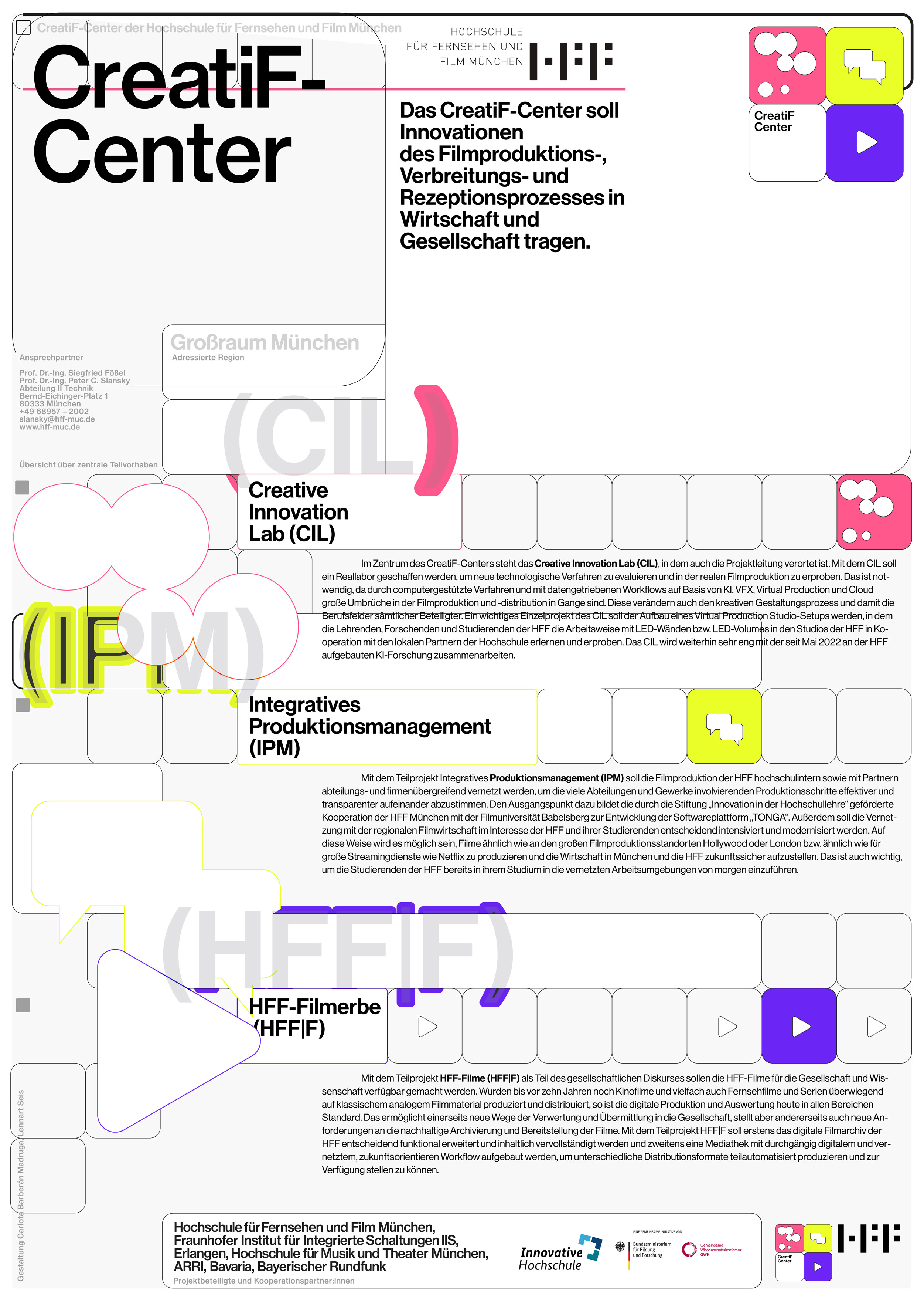
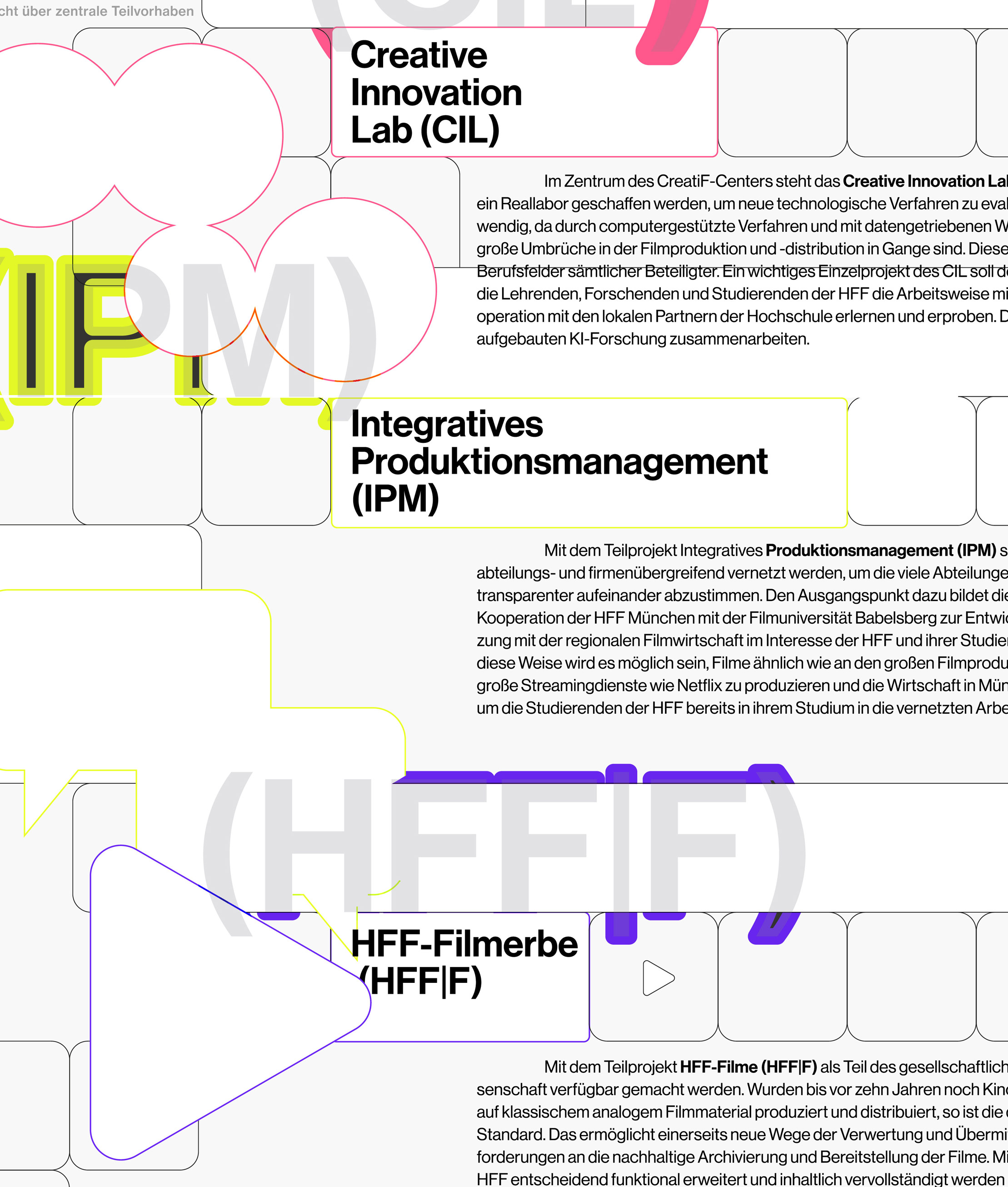
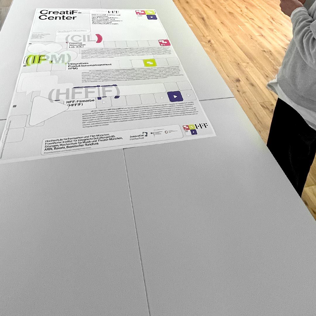
Image and Print for the HFF CreatiF Center -
Developing and testing new technologies to support creative steps of film production.
Together with Carlota Barberán Madruga.
2023
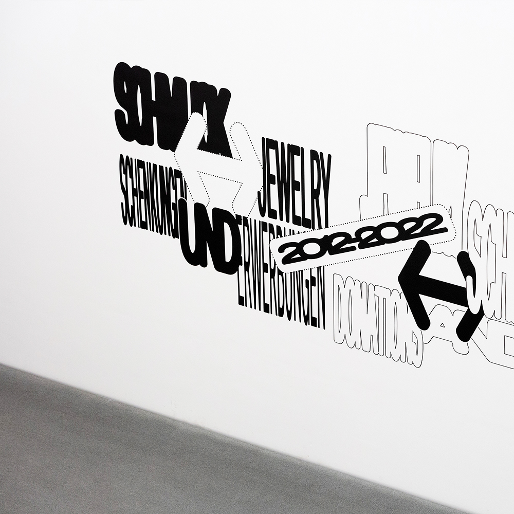
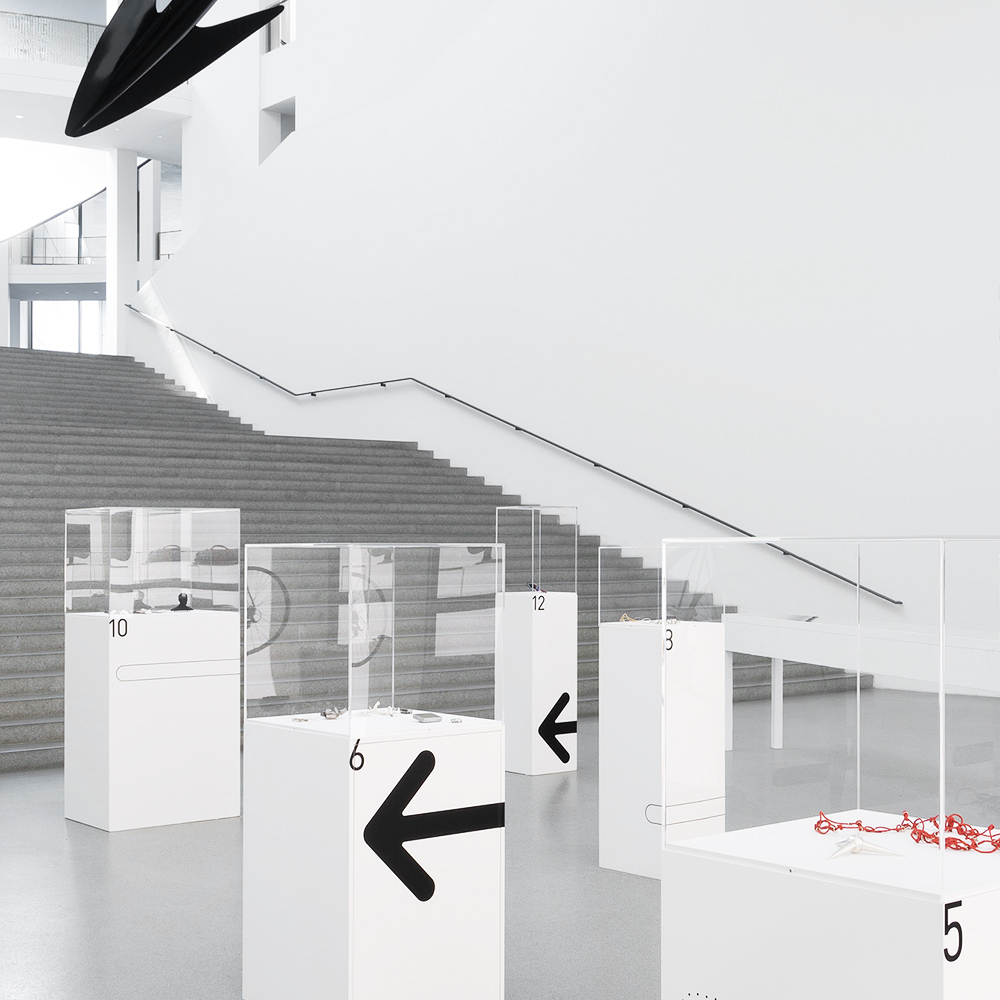
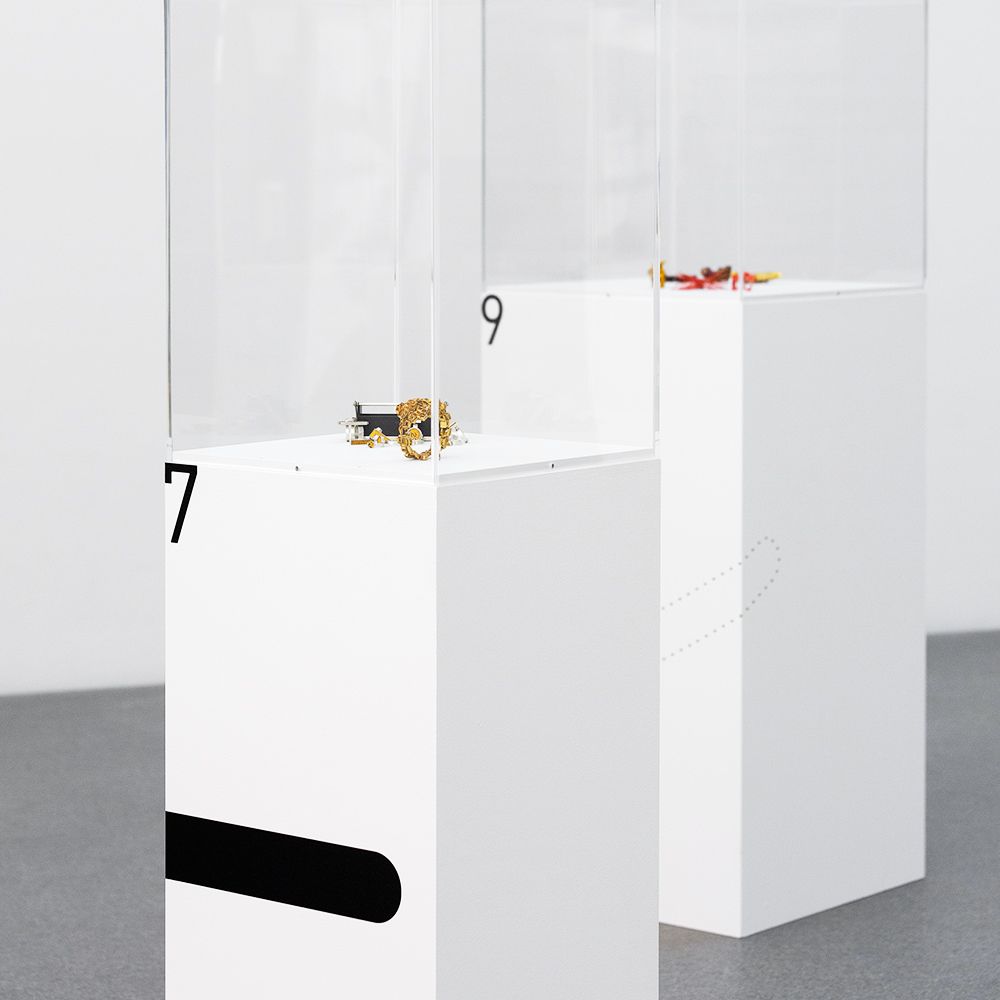
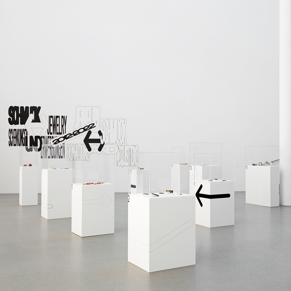
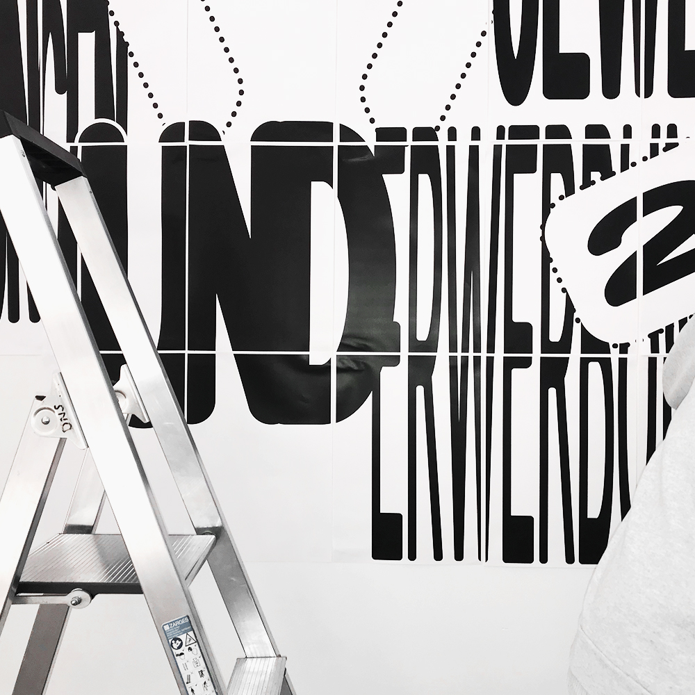
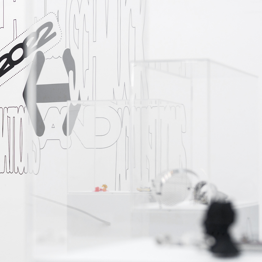
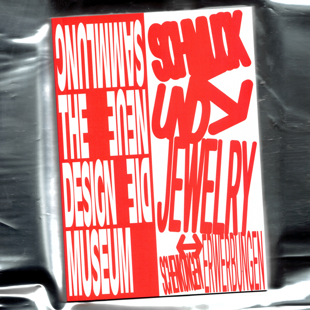
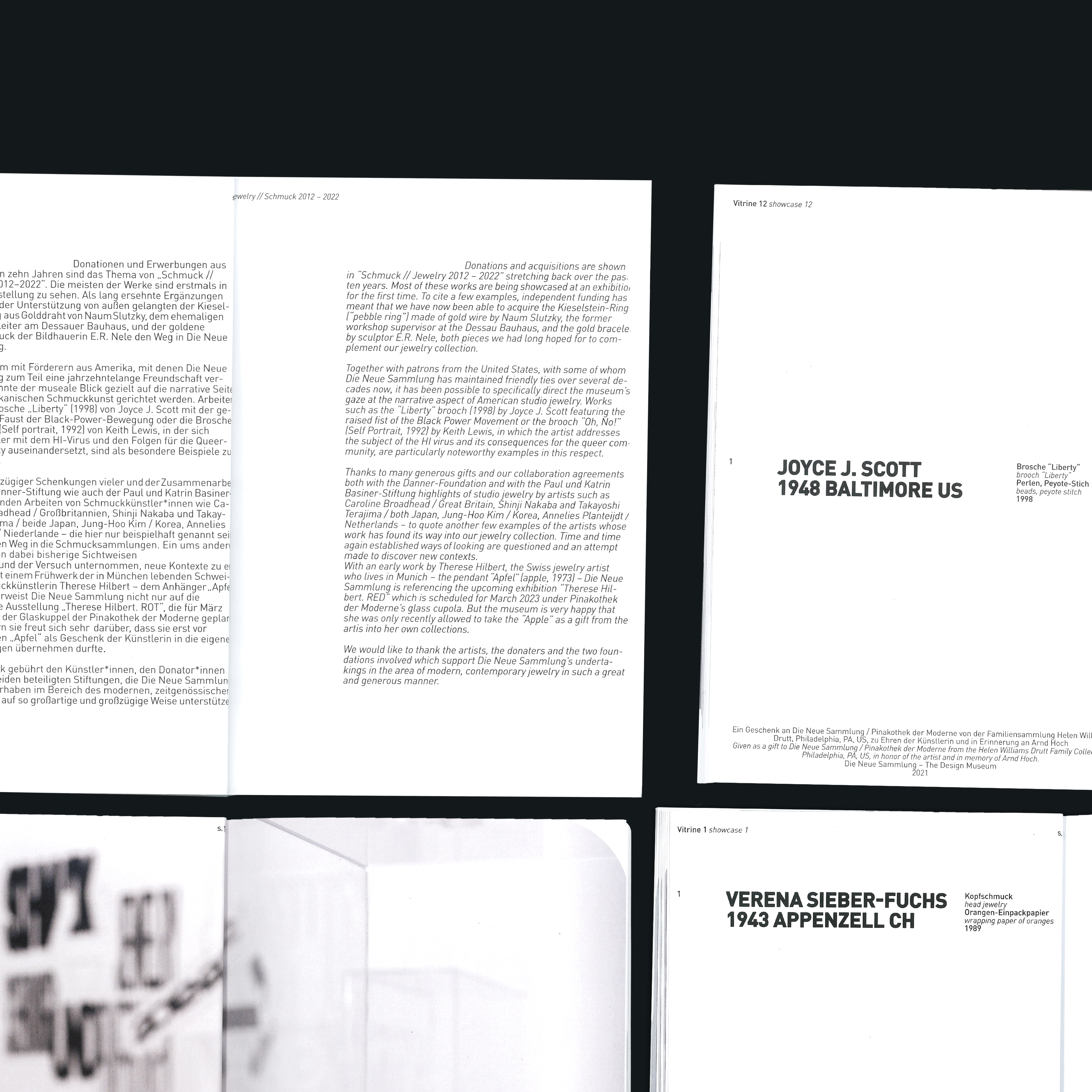
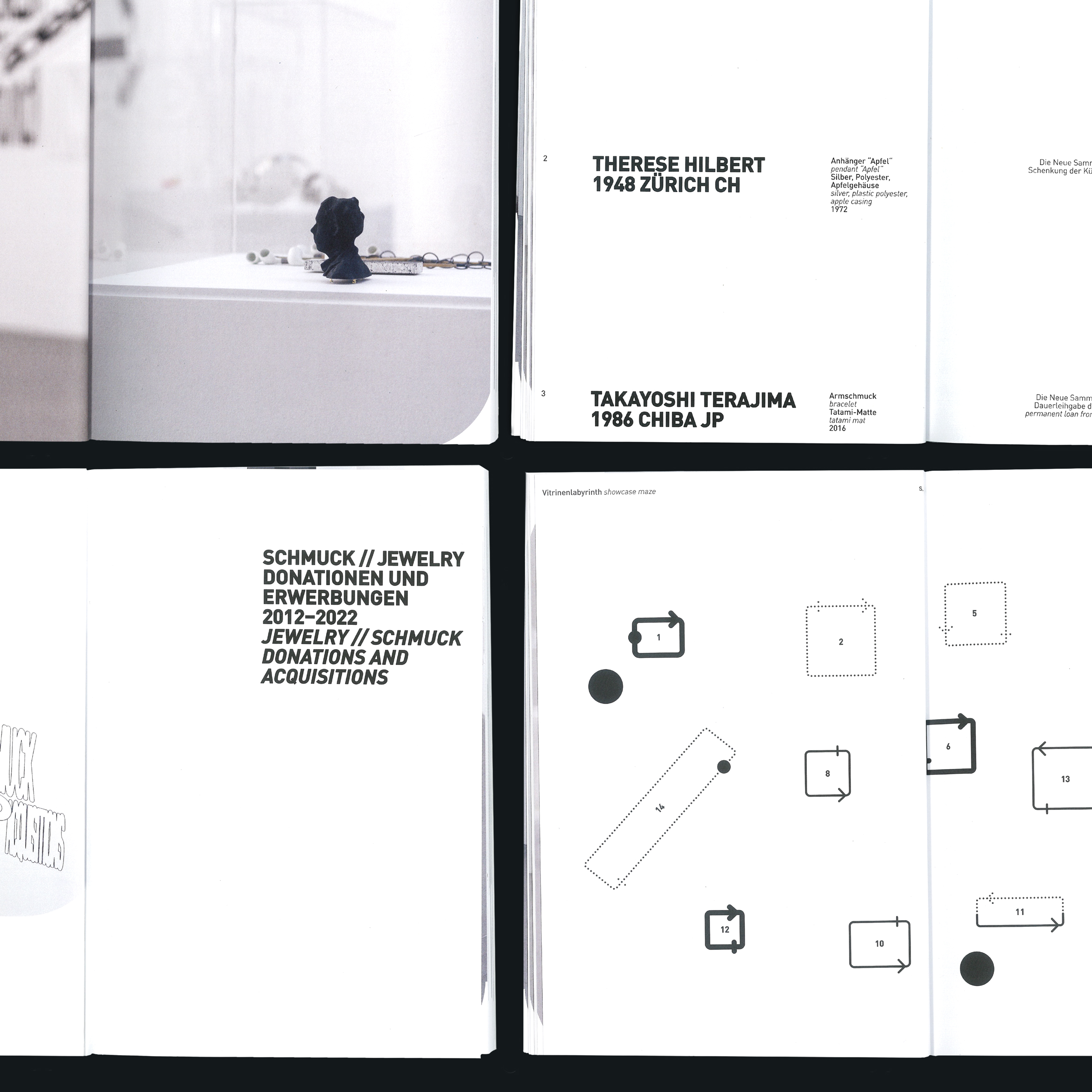
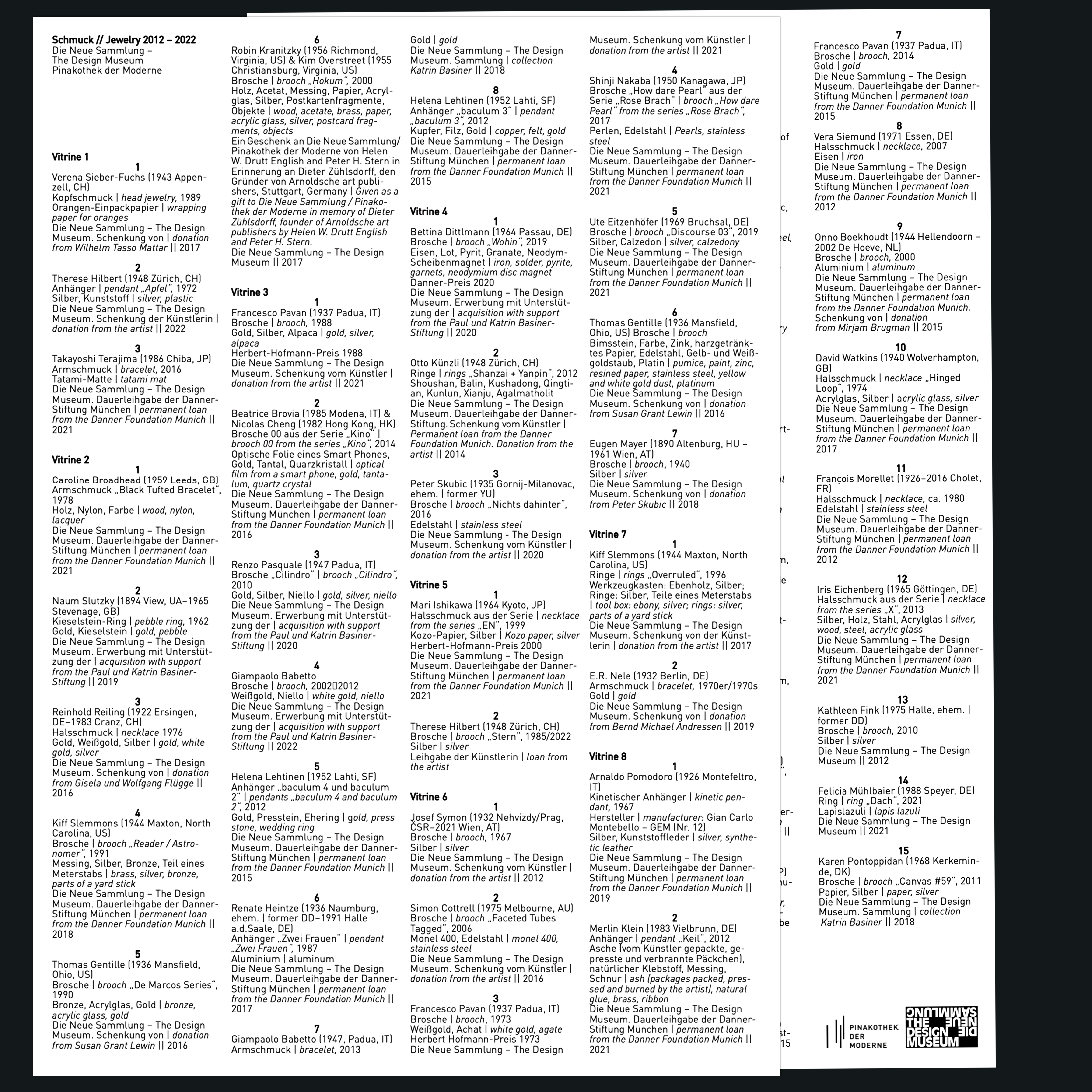
02 Schmuck//Jewelry
Booklet design as well as wall and pedestal graphics together with Carlota Barberán Madruga for the exhibition „Schmuck // Jewelry 2012–2022“ at Die Neue Sammlung, Pinakothek der Moderne.
2022
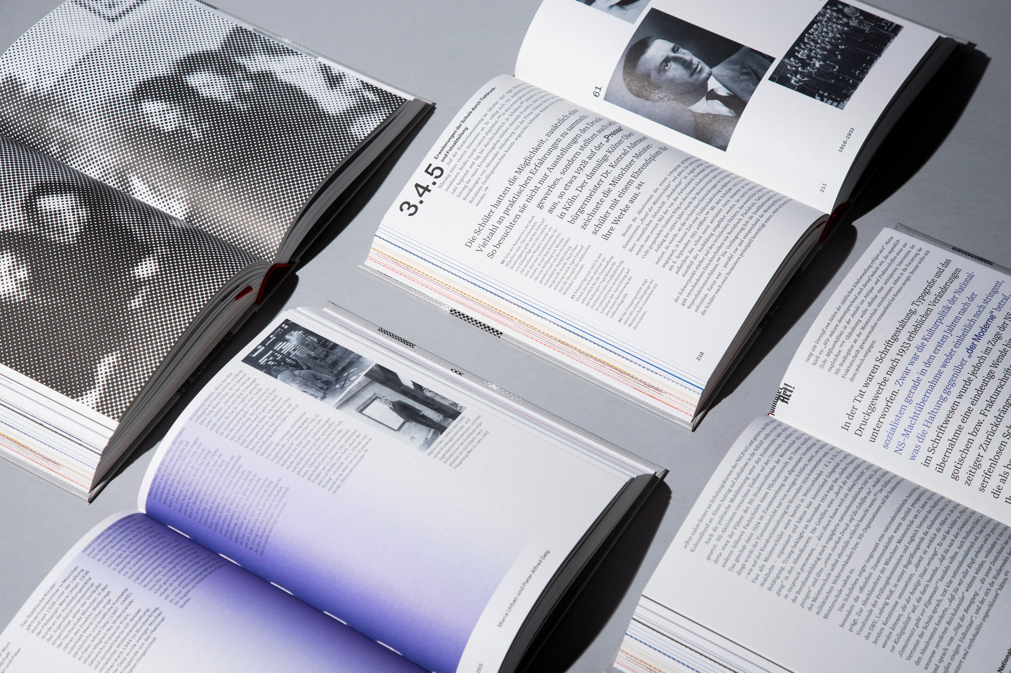
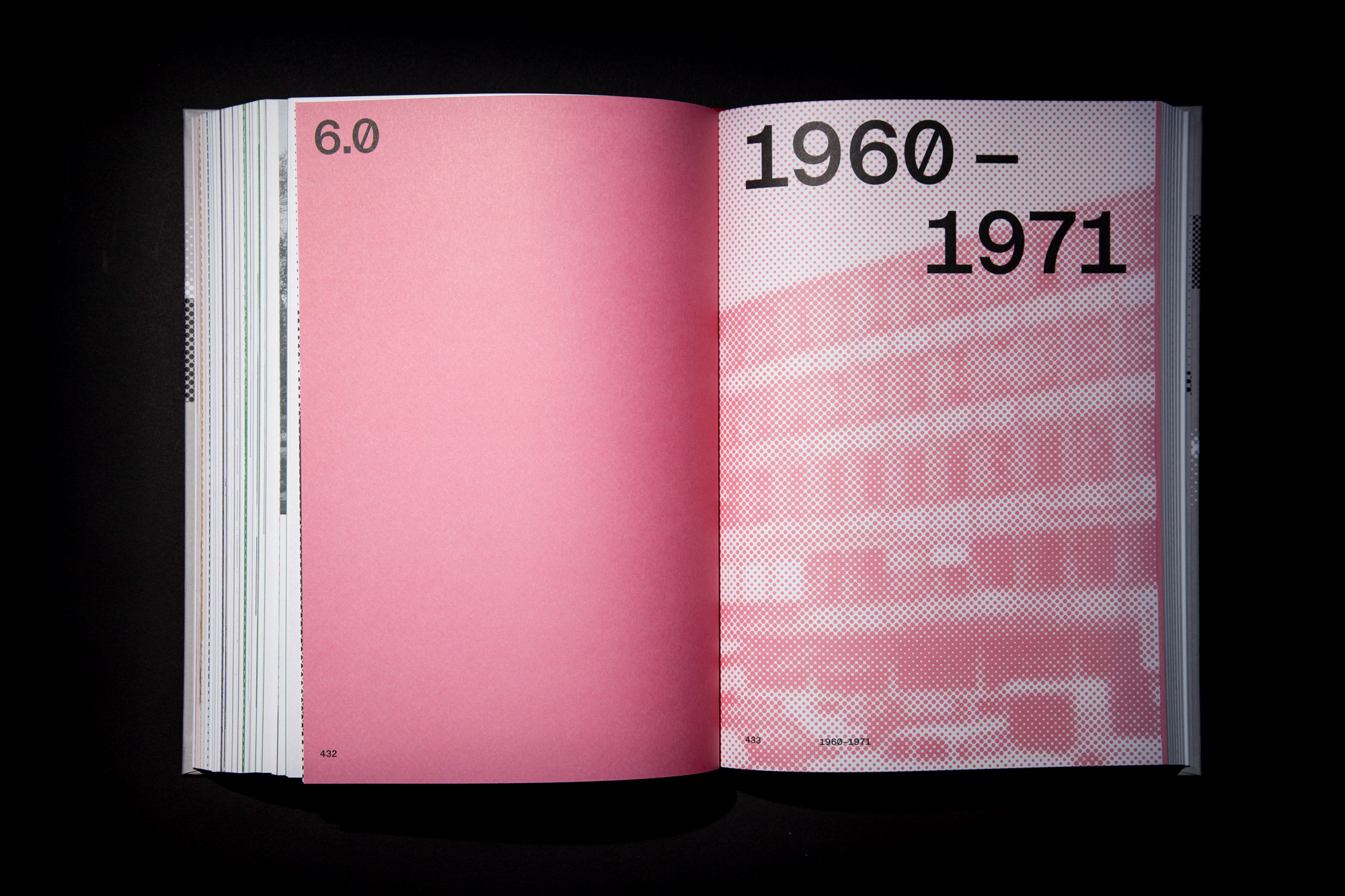
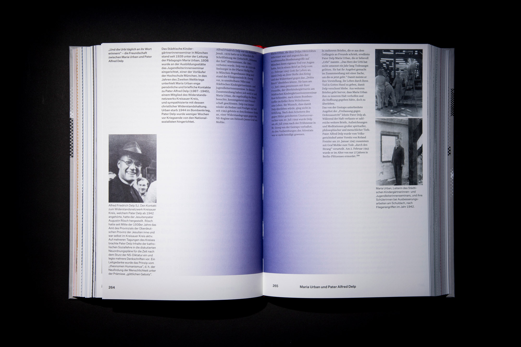
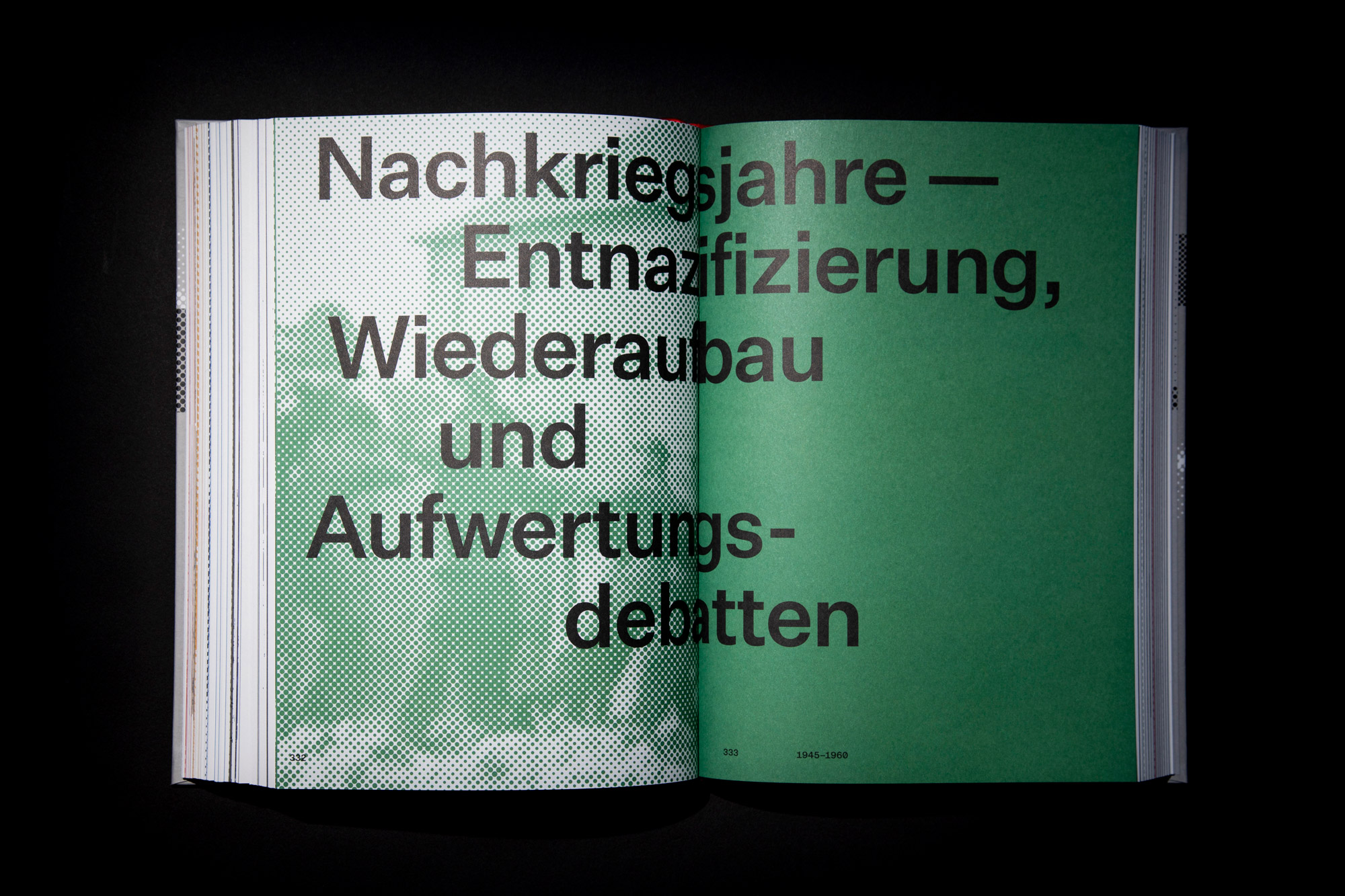
03 HM 1821–1971
On the occasion of its 50th and 200th anniversaries, the University of Munich is releasing a two-volume history publication. The first volume, which is now being released, delves into the history of the predecessor institutions of the University, which were shaped by societal and political upheavals. The design concept of the publication was created and executed by the Faculty of Design at the University of Munich.
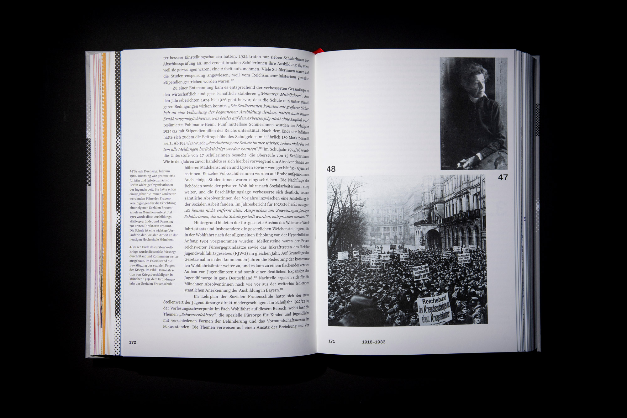
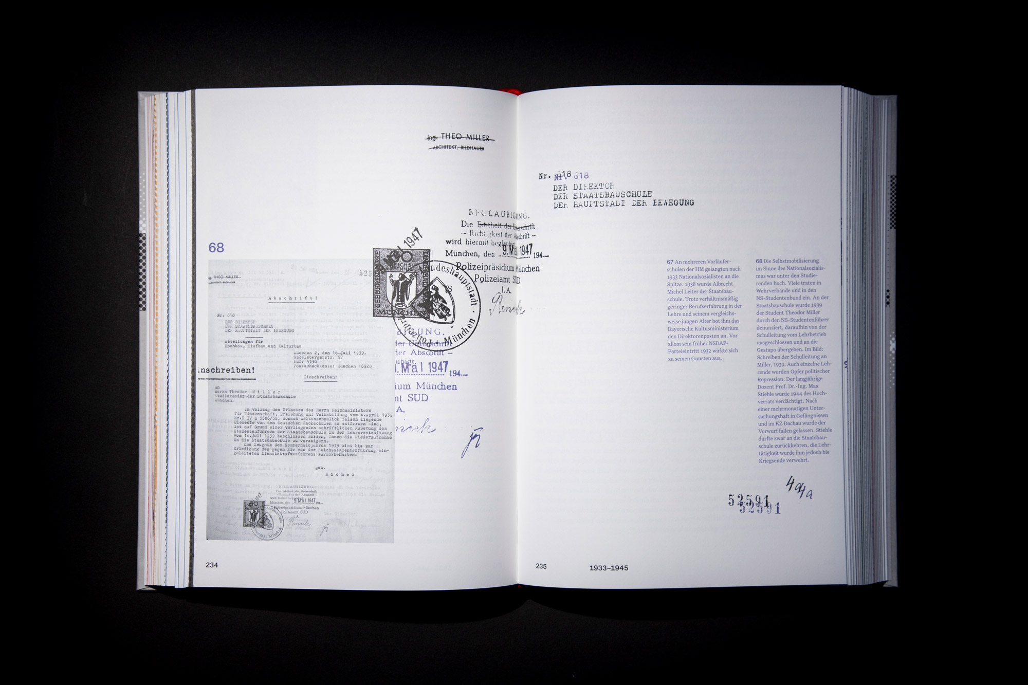
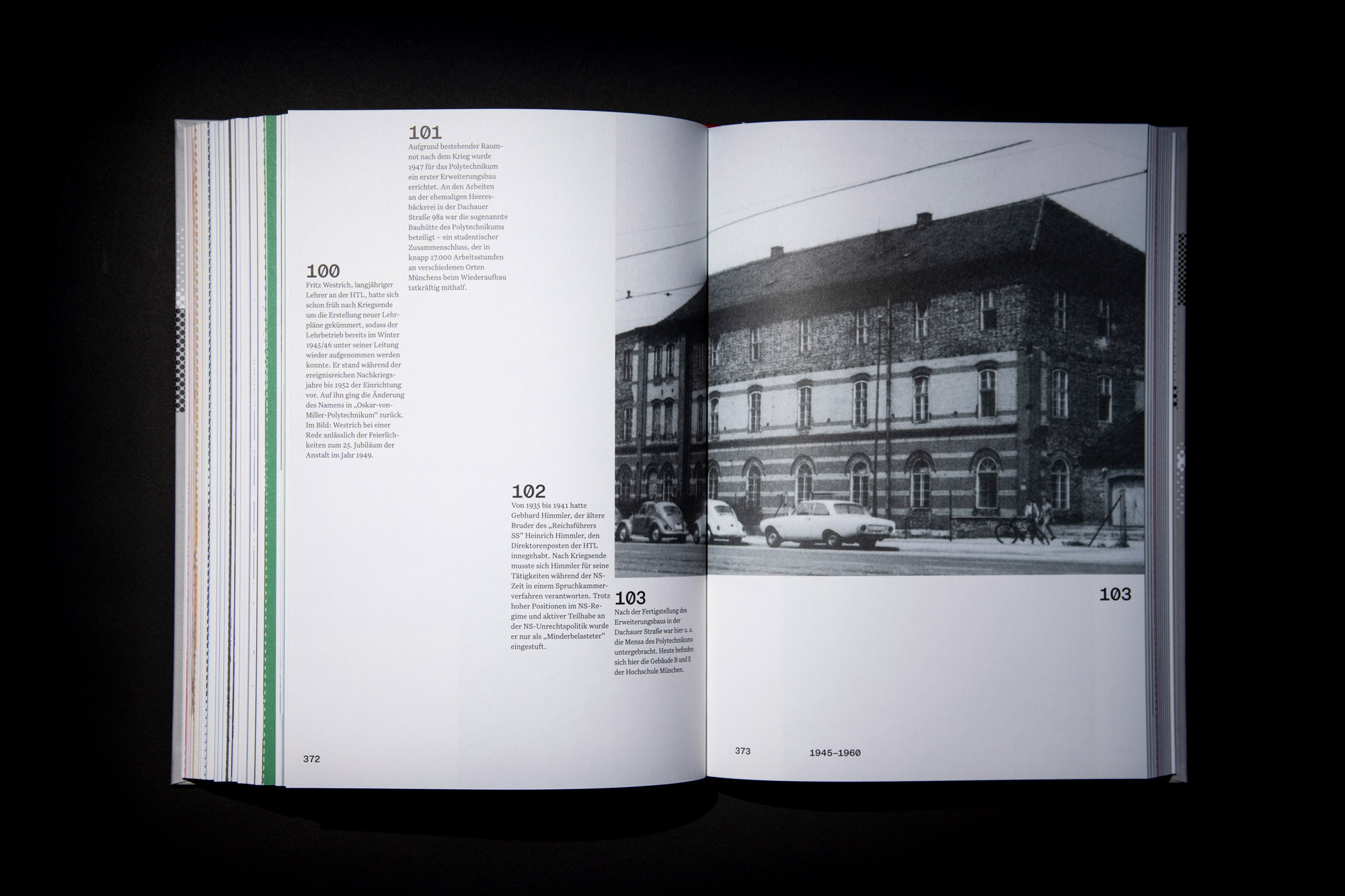
In this nearly 600-page publication, the history of the University is divided into six chapters, each distinguished by unique color and image concepts to provide its own visual identity. A strict systematic approach to design elements ensures visual consistency throughout the book: uniform font sizes, prominently placed year dates, heavily screened photographs at the beginning and end of each chapter, as well as text indentation and spacing serve as visual anchors.
2022
With Xuyen Dam, Friederike Wagner, Nicolas Pakai, Felix Schultz.
Photos of the publication - Frederic Hermann
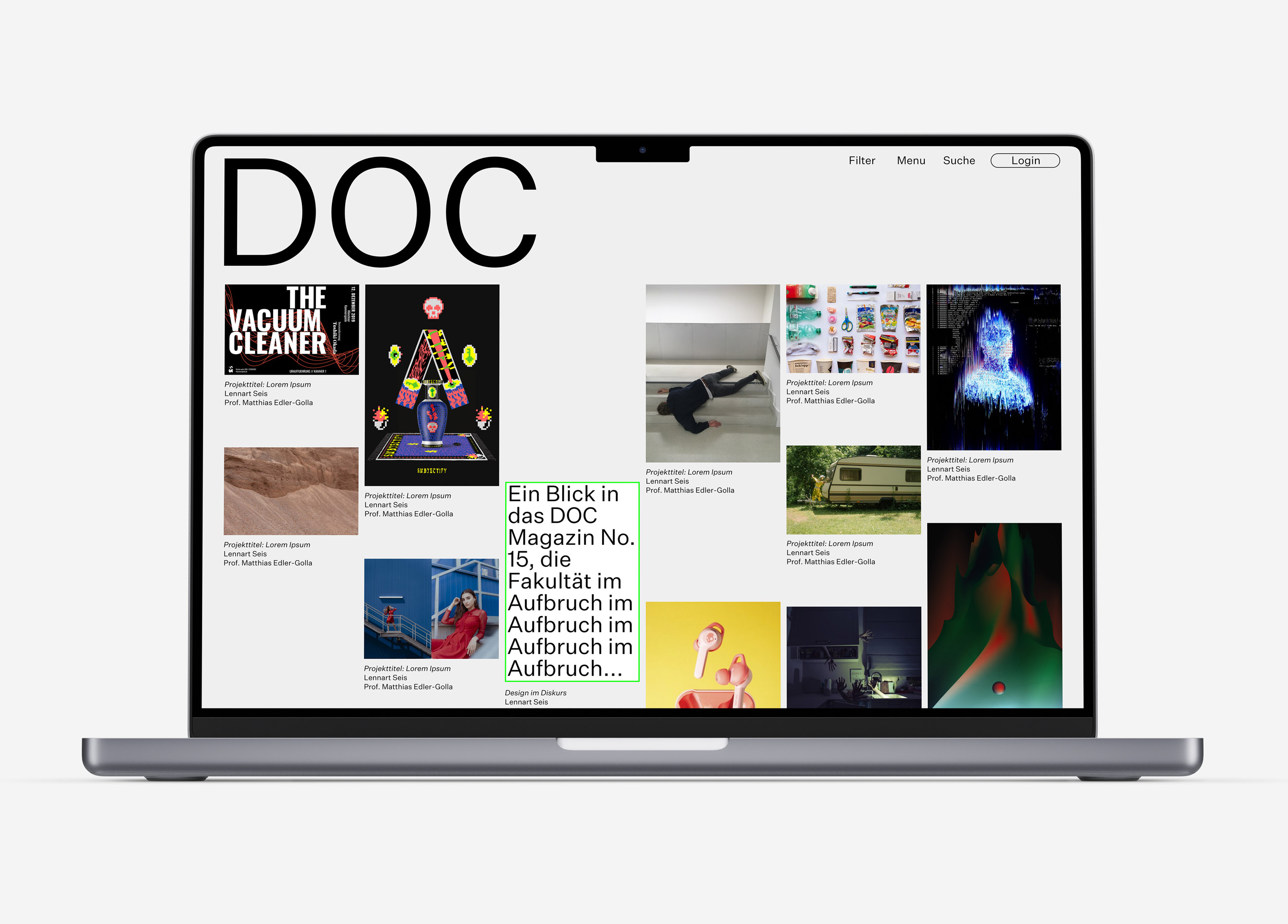
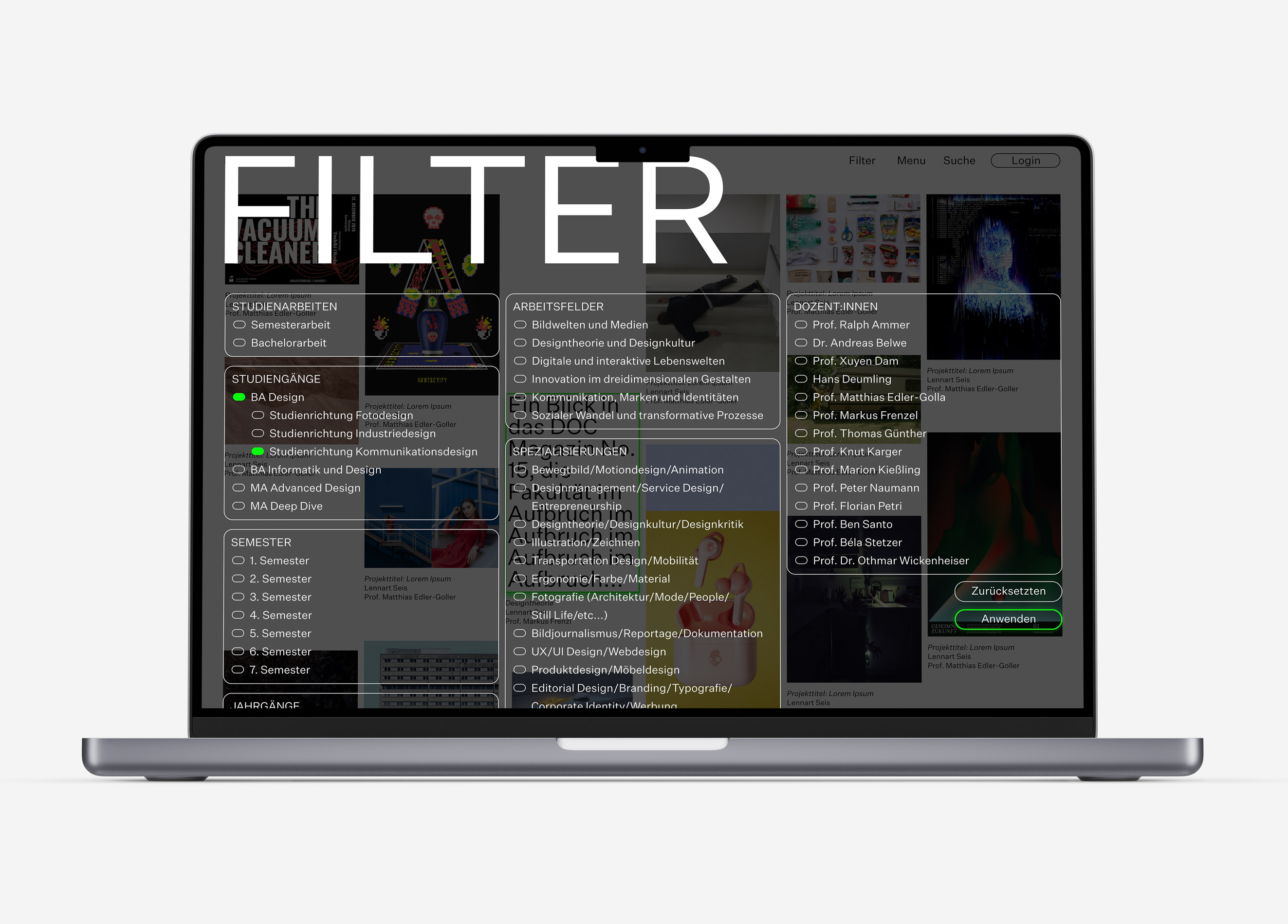
04 DOC Website
As part of our faculty publication DOC, I worked on the redesign of the DOC website. By merging various smaller websites, a large documentary website is to be created.
2022
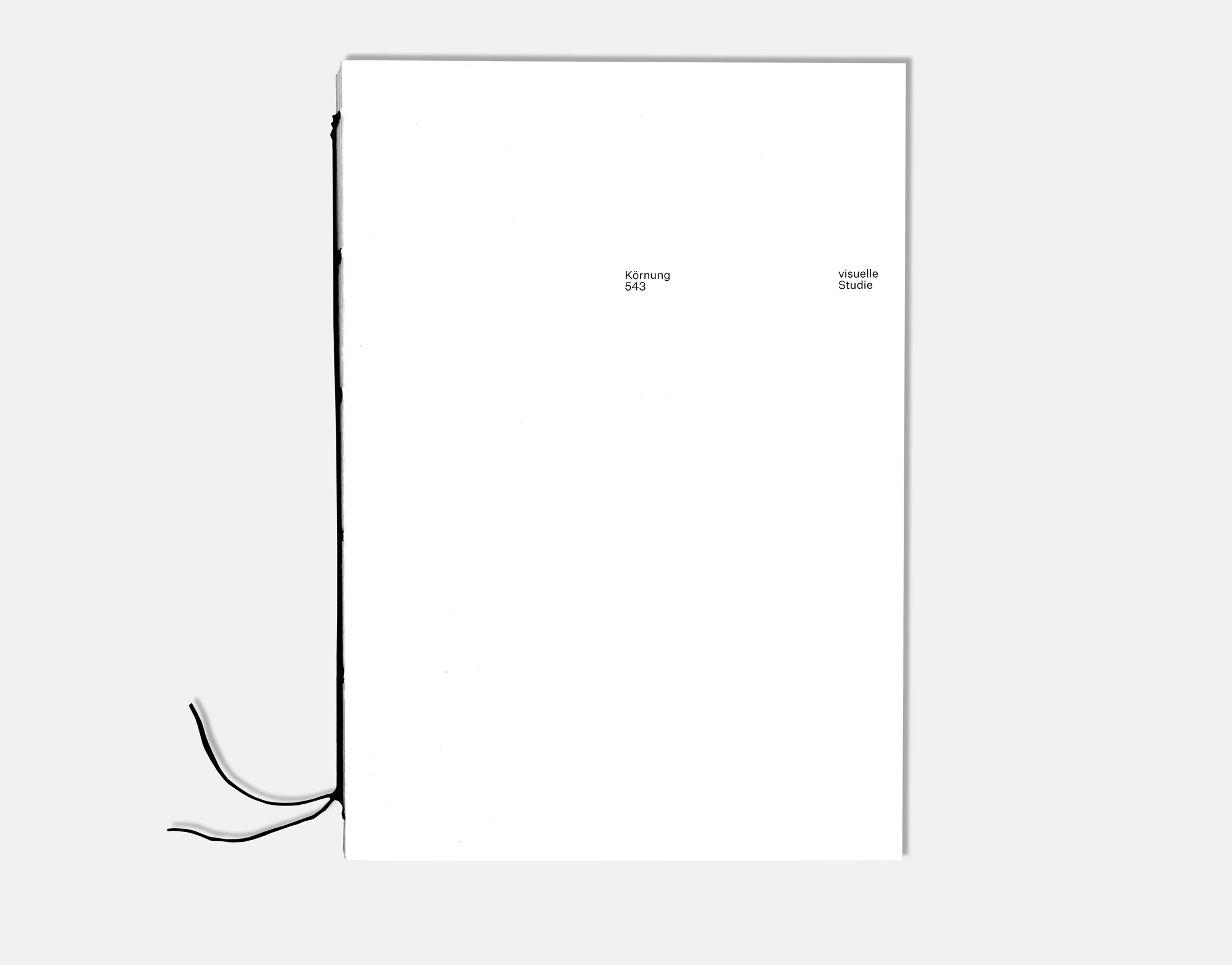
05 Körnung 543
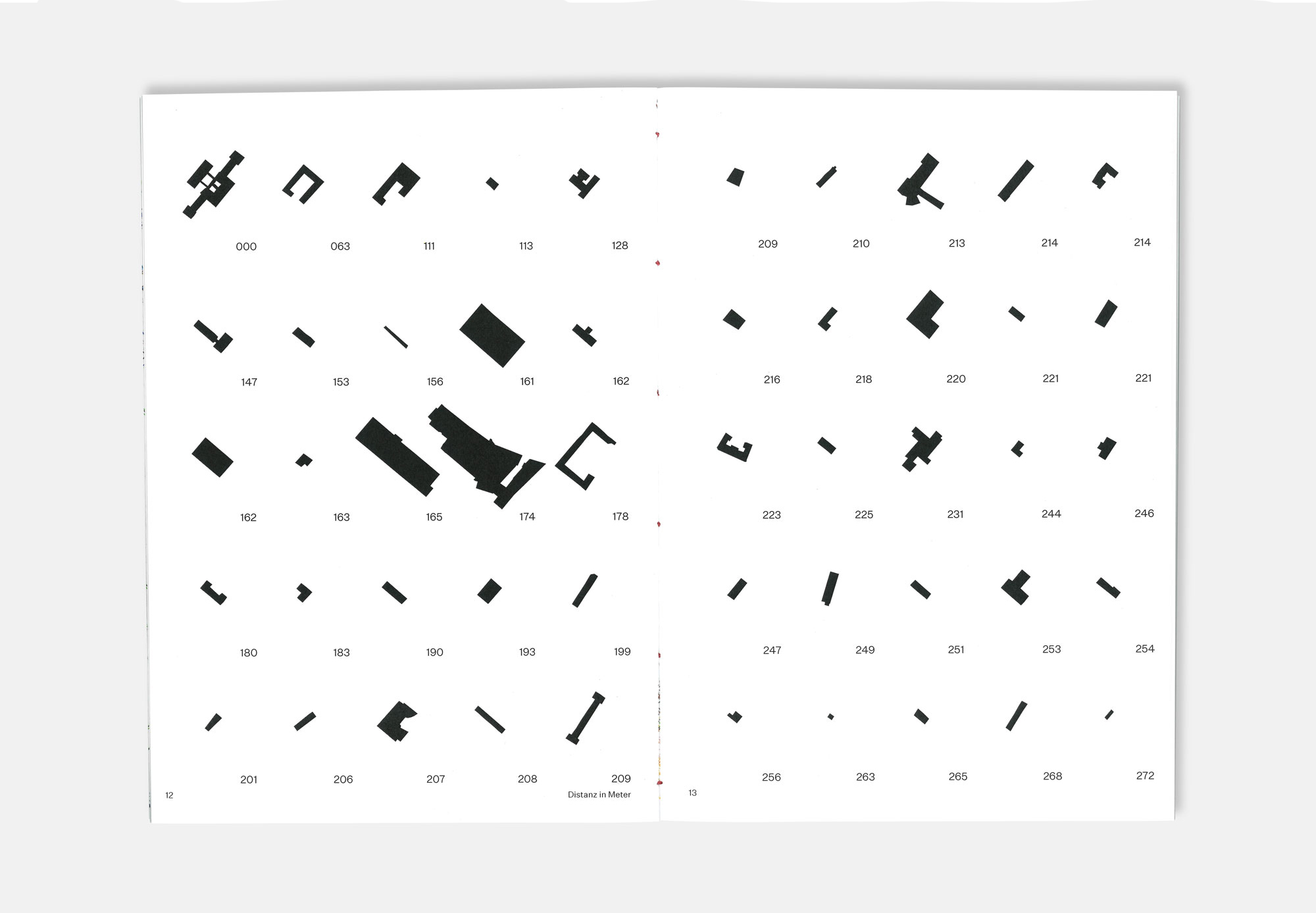
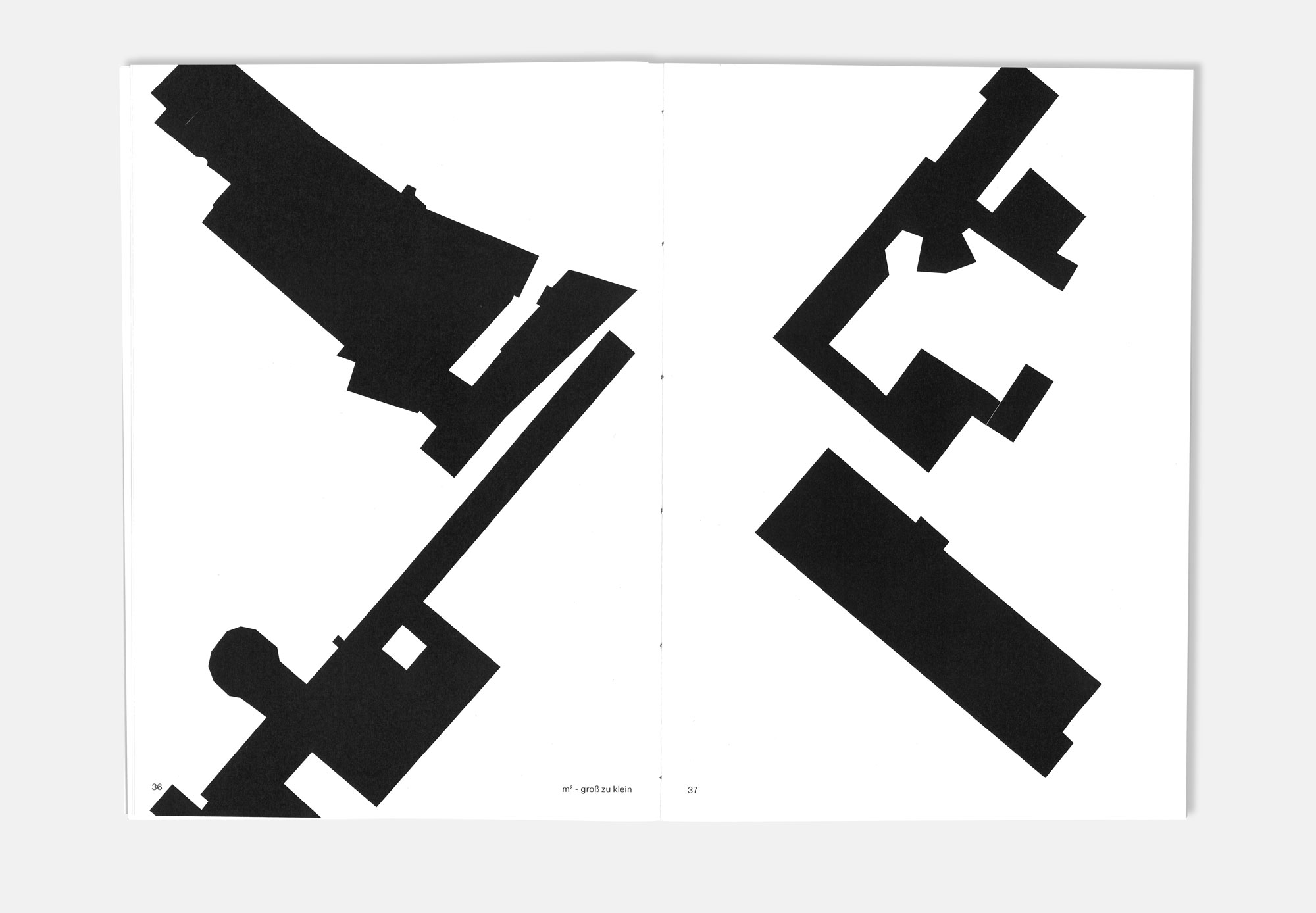
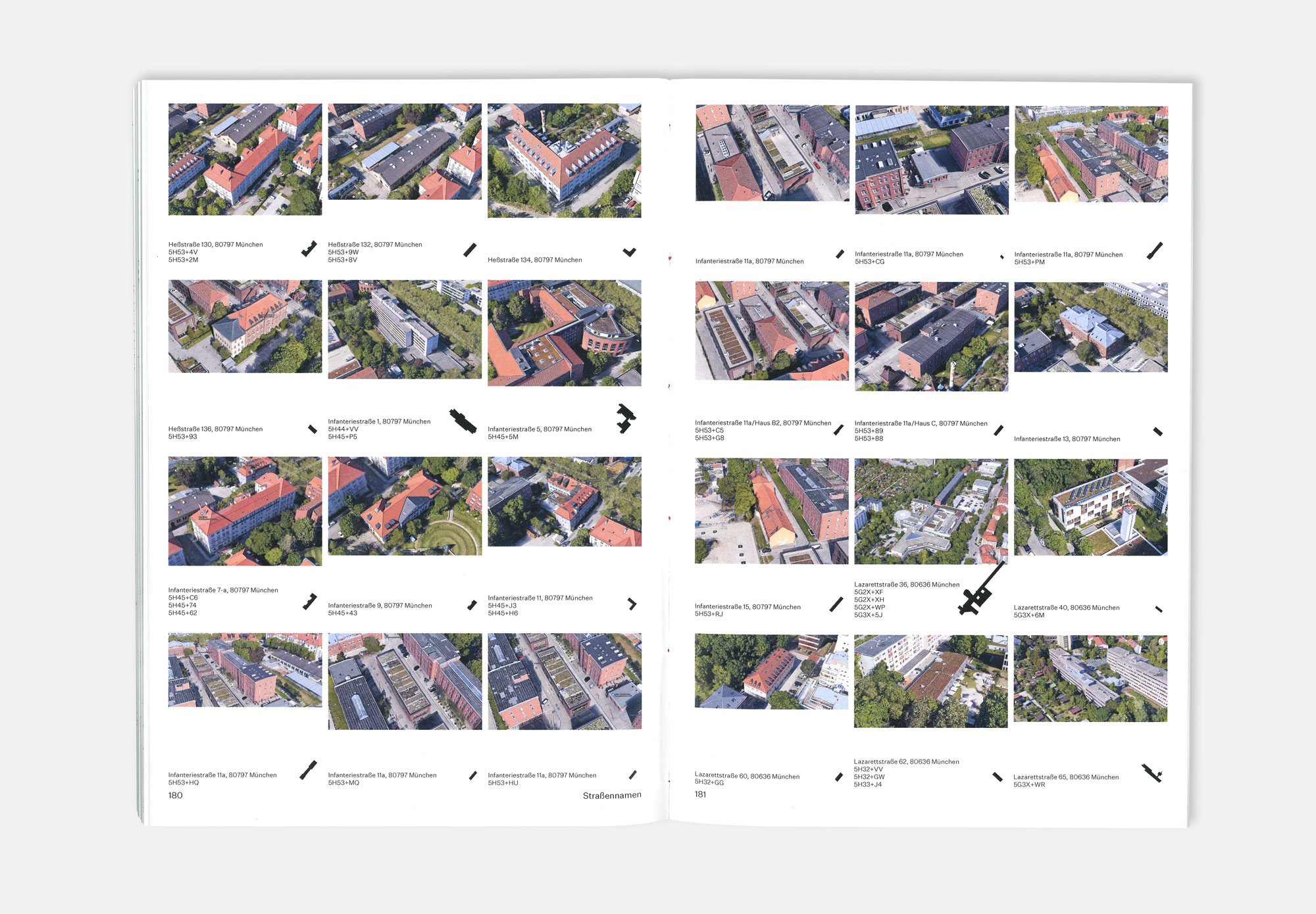
What parameters can be used to define a networked system? I try to answer this question from an urban planning perspective. The black plan serves as a basis. A black plan is an urban planning tool for the representation of buildings. All other parameters such as roads, vegetation or water bodies are hidden. This modification allows a clear distinction to be made between built-up and unbuilt-up areas. The difference in building sizes is also called grain.
As an additional parameter, I integrate the stream plan of the city of Munich. This creates another level to be analysed.
The elements that now exist are examined and visualised in different categories. New spatial effects emerge and the classic view of a city map is broken. Thus a visually unknown urban language is formed.
3D aerial photographs support the visual concept and create the optical bridge between black plan and reality.
2021
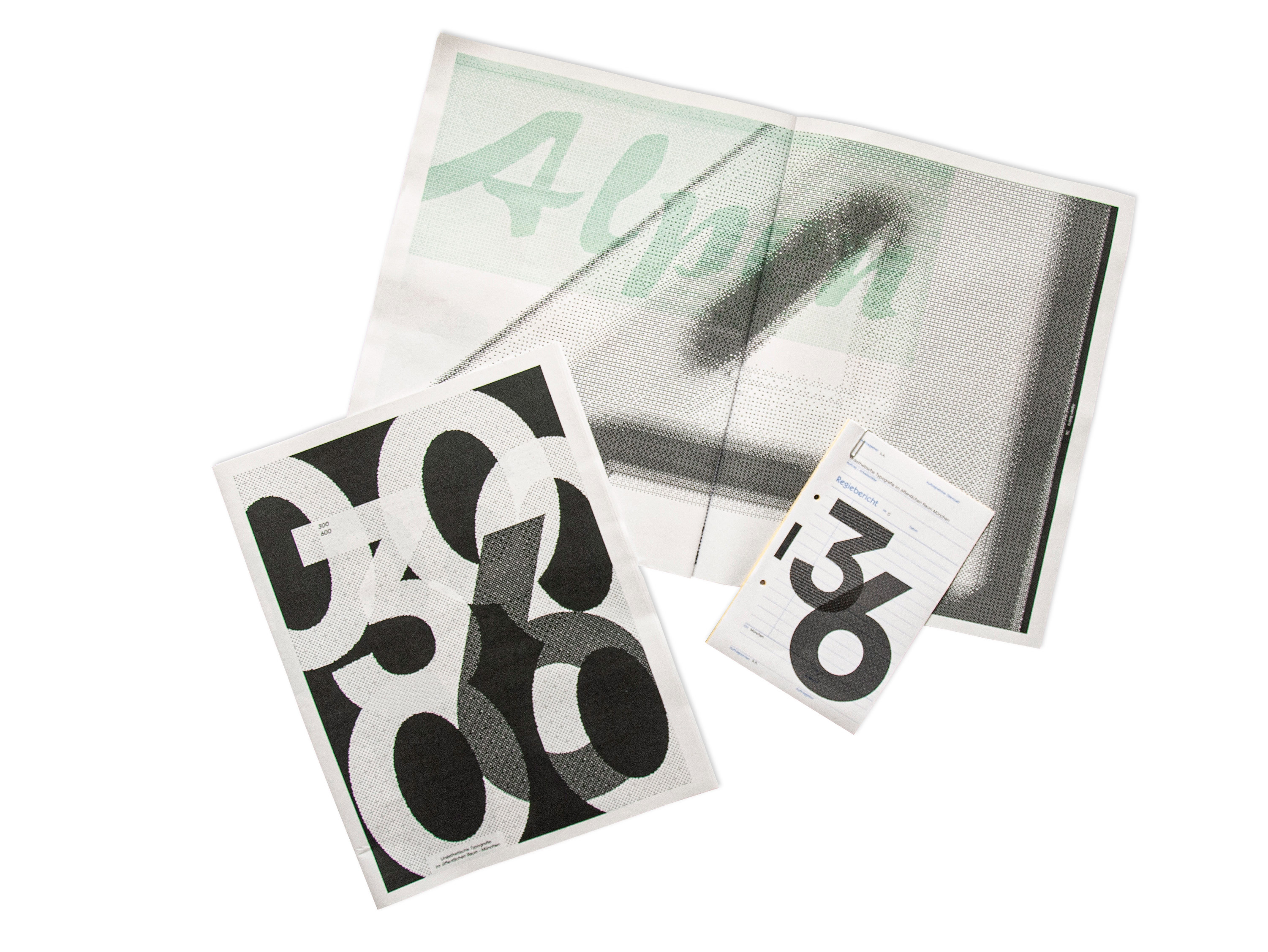
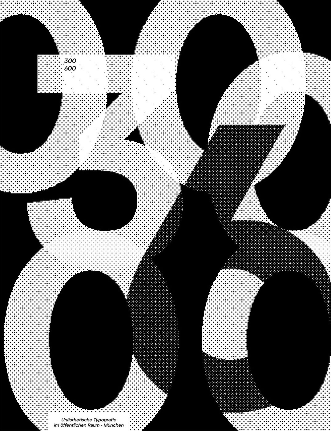
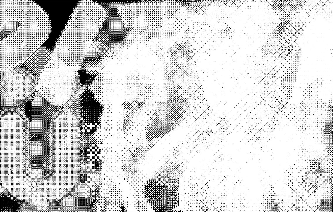
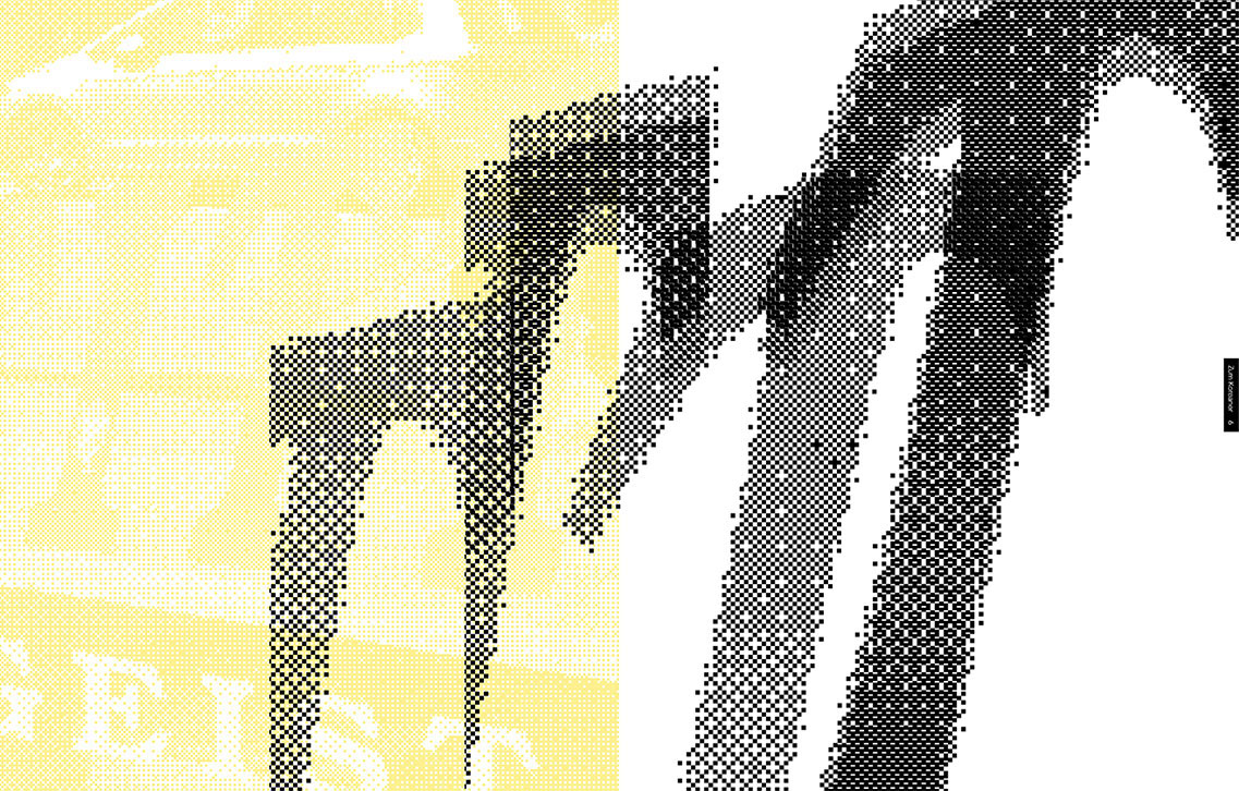
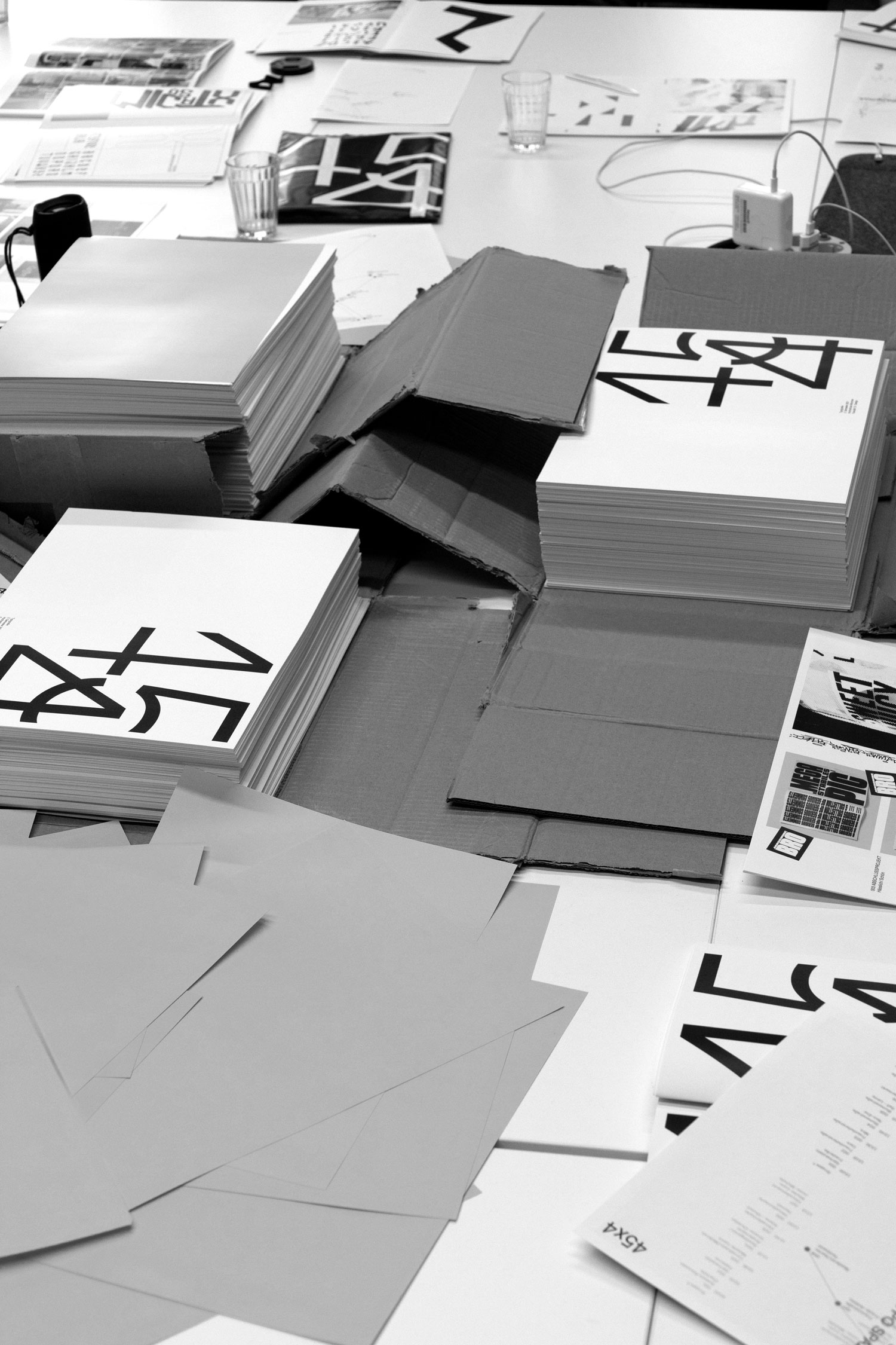
06 300600 Newspaper
Unaesthetic typography can be found all over the city.
In search of the most unaesthetic typographic elements in public space, I mainly searched around the Munich districts of Giesing, Isarvorstadt, Maxvorstadt and Schwabing.
By rasterize the images, the typeface is placed in a new design context. The original shape of the letters are broken up an the boundaries redefined.
300600 is derived from the enlargement levels of the individual letters and the coloured images.
2021
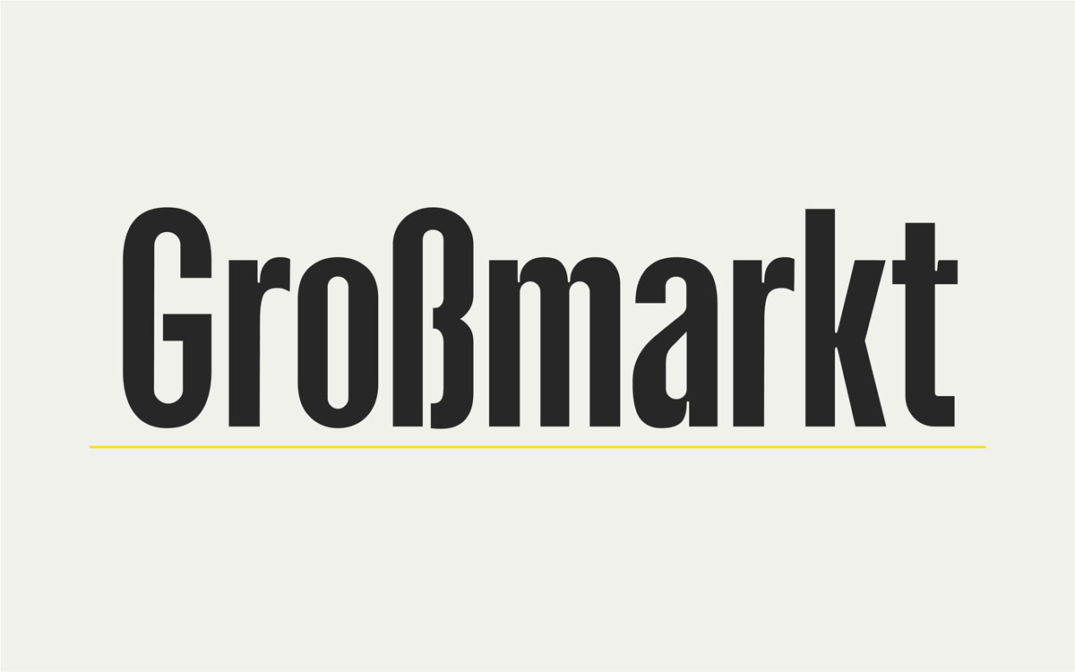
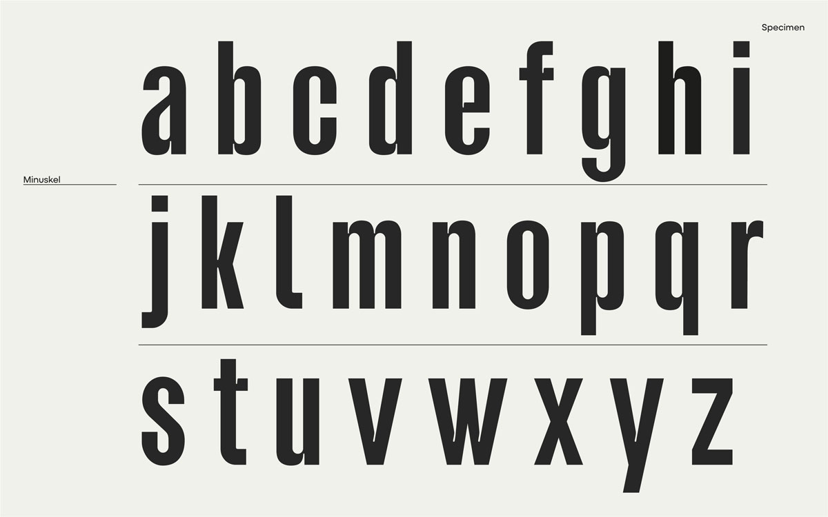
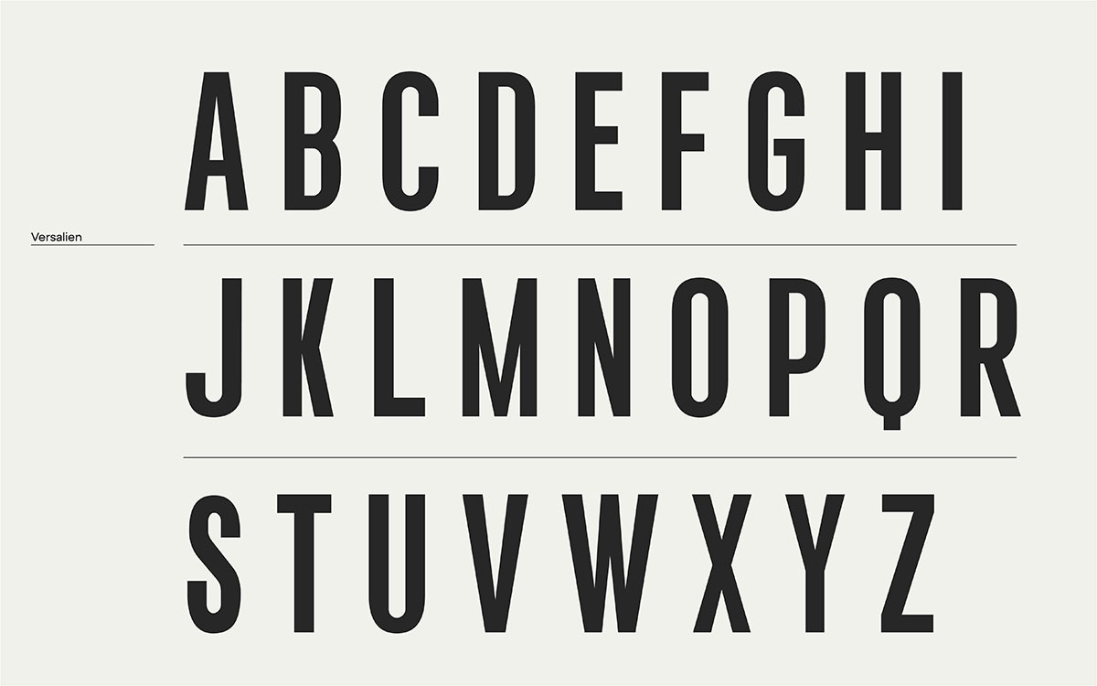
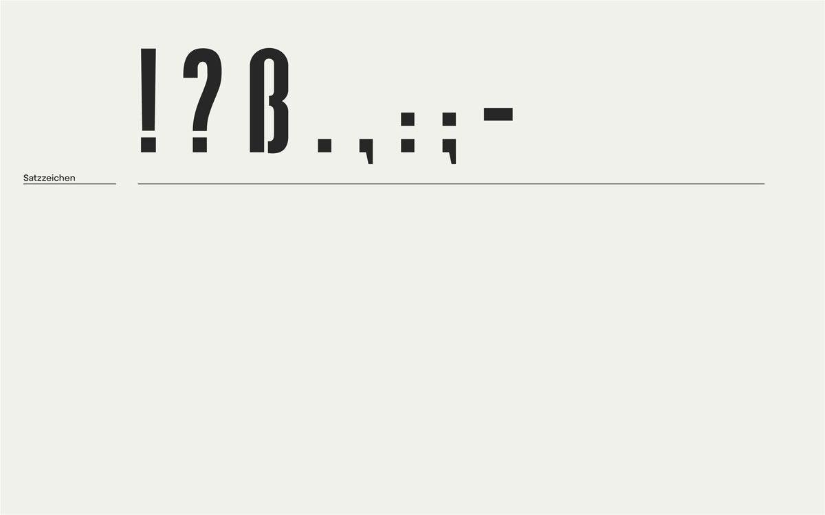
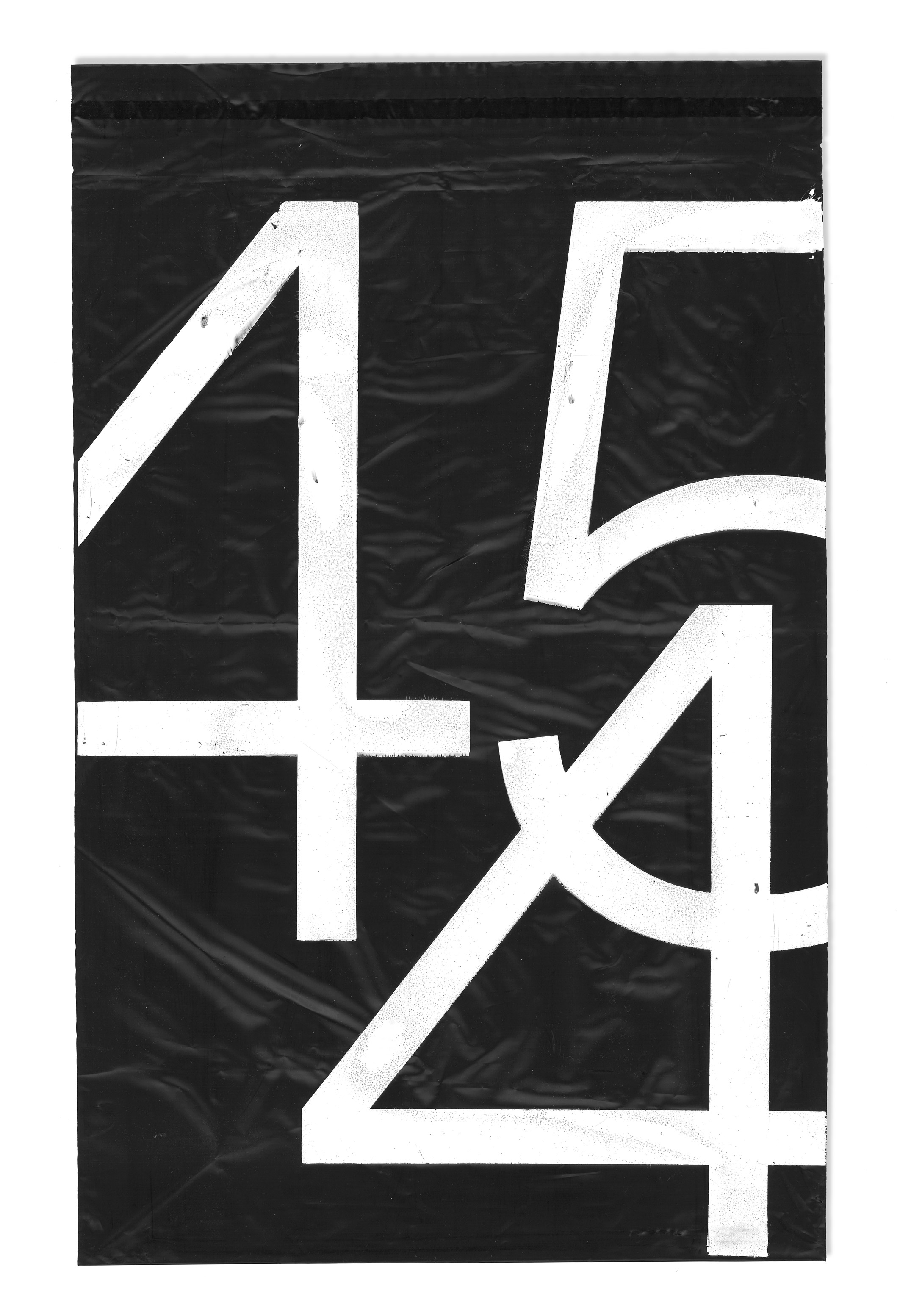
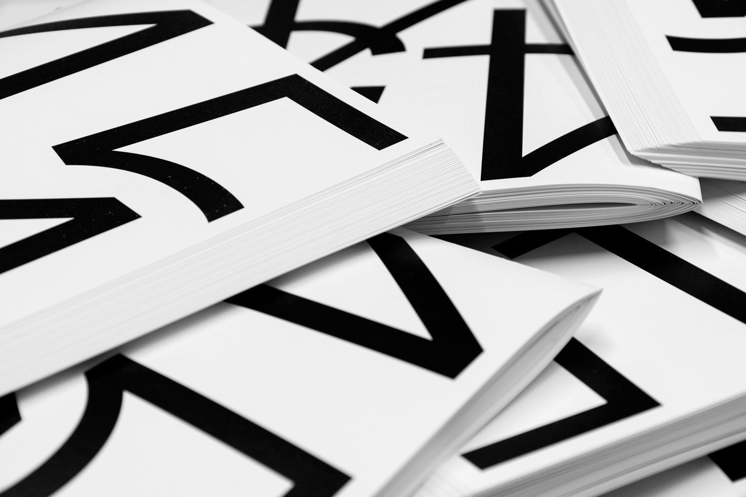
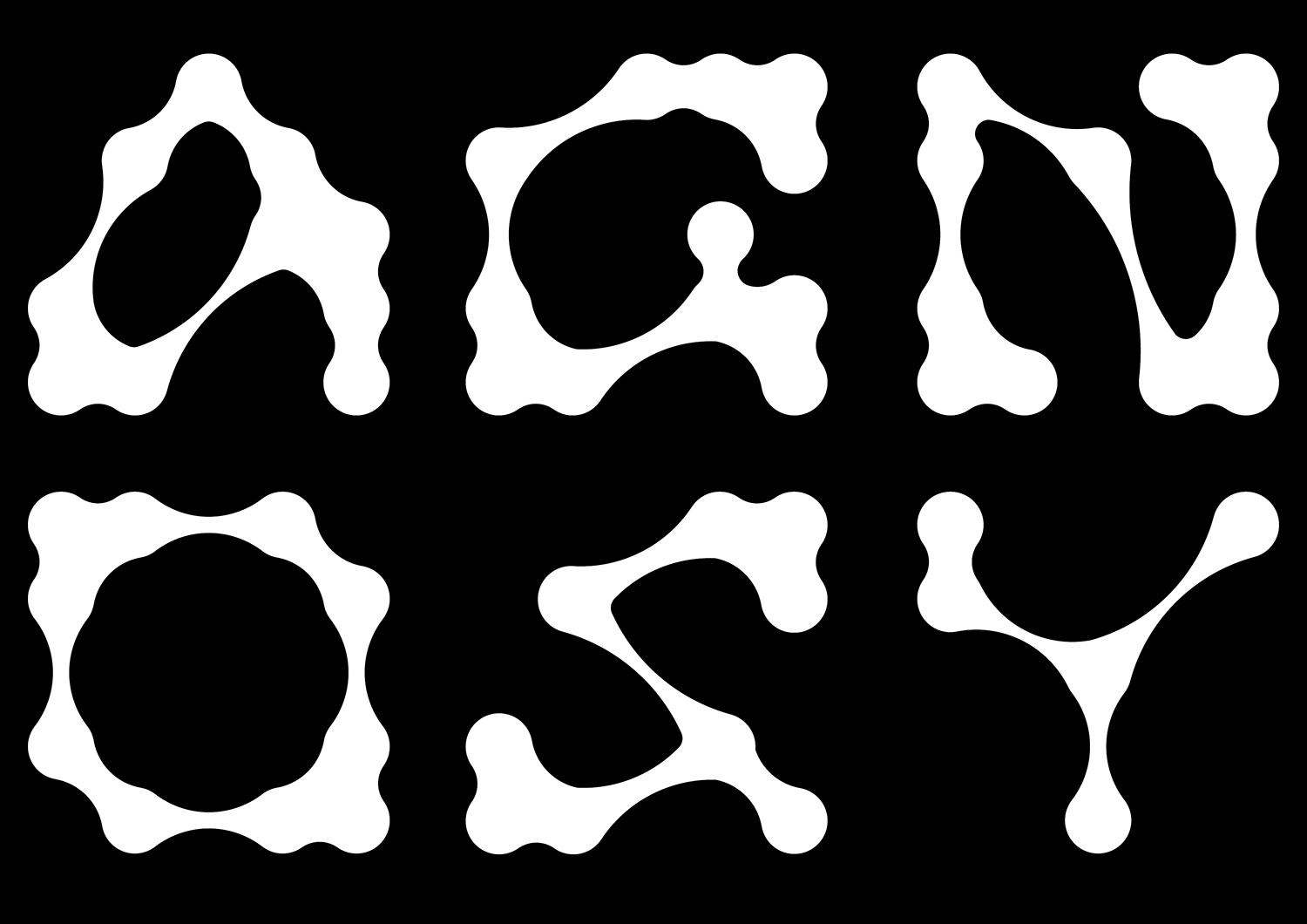
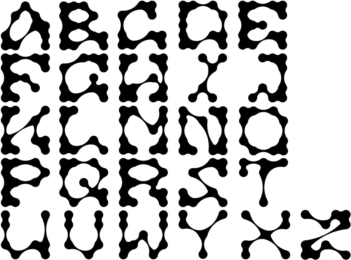
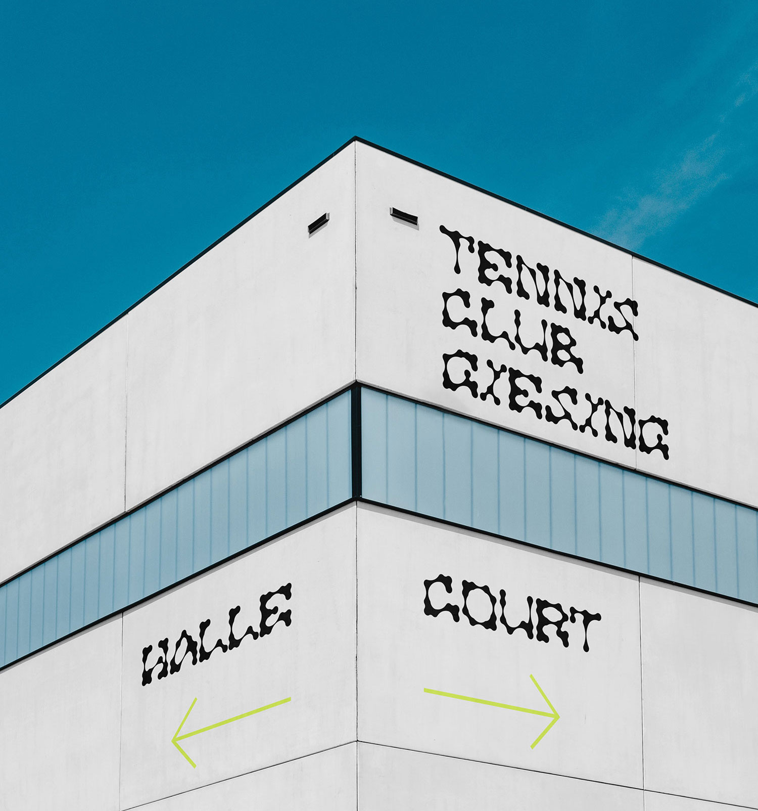
07 Großmarkt Font
Großmarkt is inspired by metal type printing history as well as engineered letters stamped onto road signs. It uses the visual gesture of ink spreading under pressure as a stylistic device, offering an alternative to more spindly typefaces of the digital age.
2021
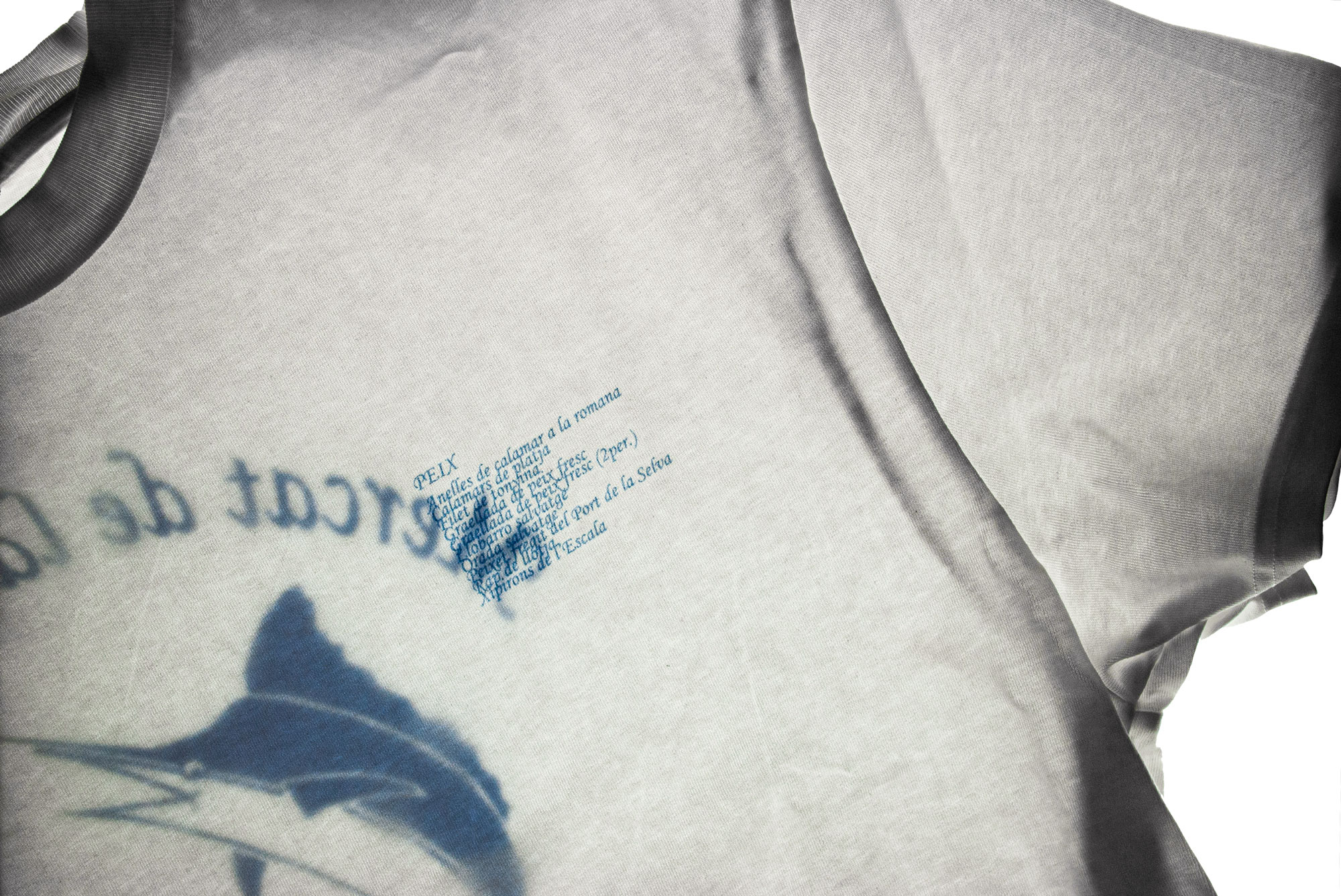
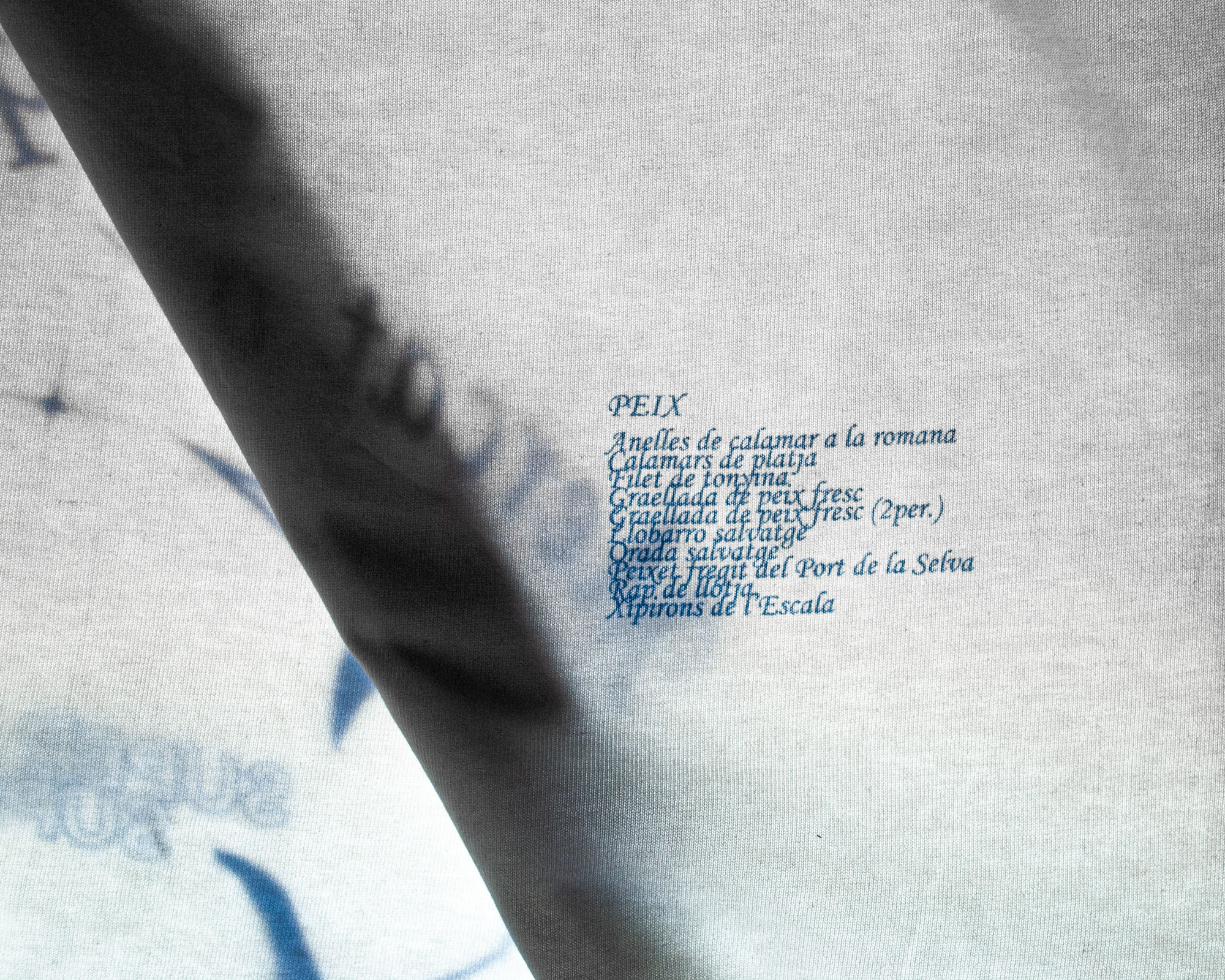
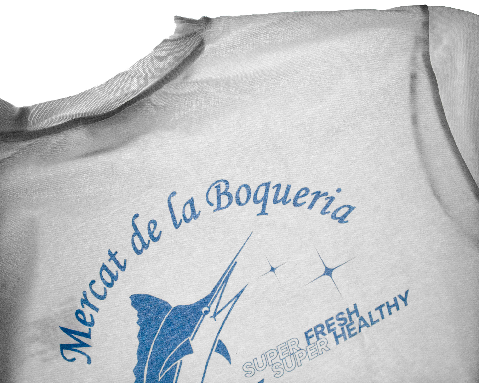
08 Mercat de la Boqueria
Super fresh. Super healthy.
2021
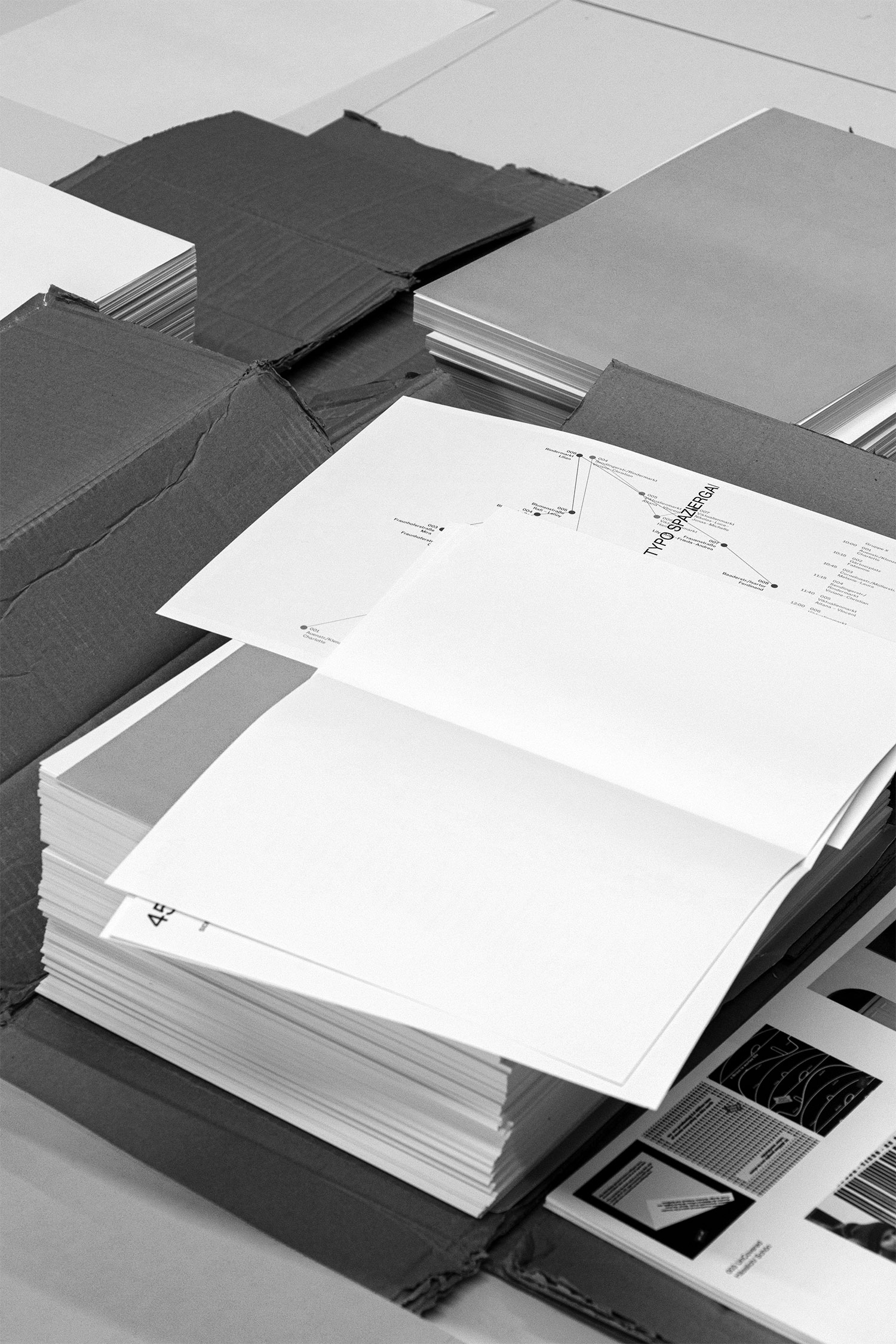
09 Typografie Dokumentation
A collection of all the typography work created by all the students in our 2nd semester. Collected in a loose binding.
No hierarchy. No page numbers. 4 pages per student.
2020
10 Topspin Font
A typeface development where tennis balls were used as an idea template. The typeface contains strong dynamics and flexibility.